Sheffield Children’s Hospital Charity
Branding | Copywriting | Creative direction
Reinvigorating a beloved charity with lots of heart
For almost 50 years Sheffield Children’s Hospital Charity have been bringing laughter and comfort to where they’re needed most. They make such a difference to so many young people in the region and beyond – including some in our own lives. So it was a real privilege when they asked us to freshen up their brand.
As the charity were bringing ‘Sheffield’ back into their name, they wanted to make sure all elements of their brand represent their pride in helping change the lives of patients and families at Sheffield Children's. Beyond just a new name and logo, they asked for our help in refining their look and feel and making deeper connections with their audiences.
Working collaboratively
This project was very much a collaboration. We didn’t just work with the charity team but also with patients, families and staff at the hospital, and some super-talented Sheffield-based creatives.
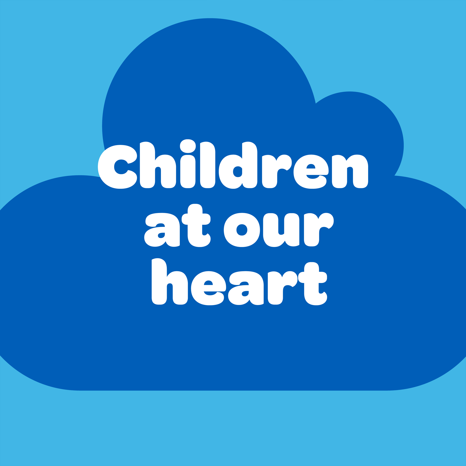
Our first phase was consultation. From what we heard from staff, families, donors, partners and the public, it became clear that what’s valued most in the charity is its care and compassion. We honed in on this idea – of children and young people being at the heart of everything the charity does – and worked it into both messaging and visuals.
Big thanks to 8-year-old Sheffield Children’s patient Florrie Bark for drawing the heart for the new logo. And shout-out to motion designer Dan Mayers for animating it.
Creative approach
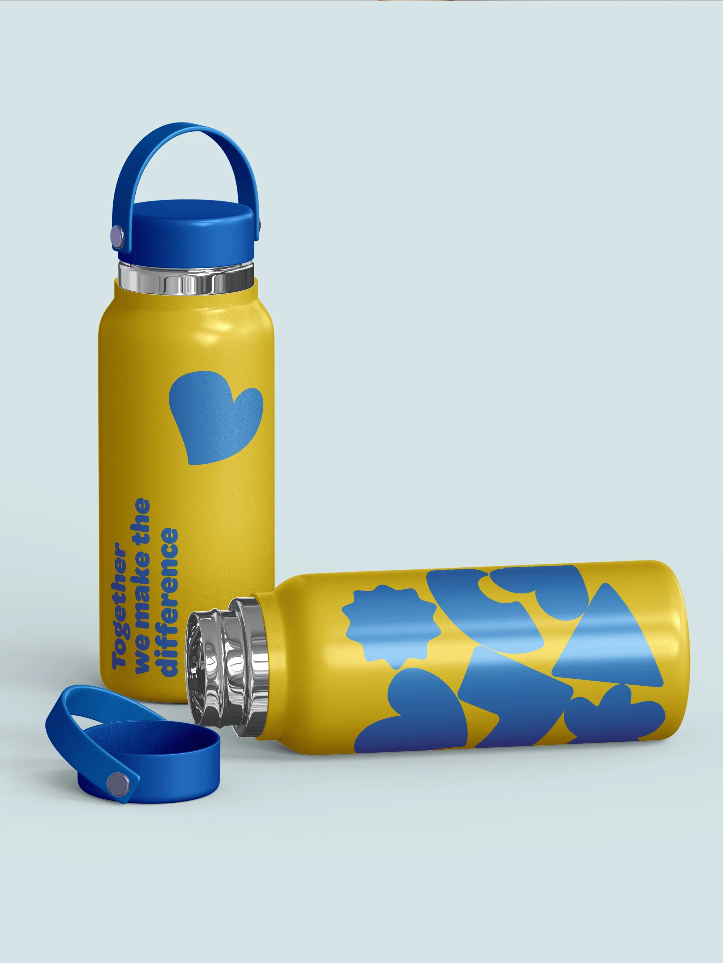
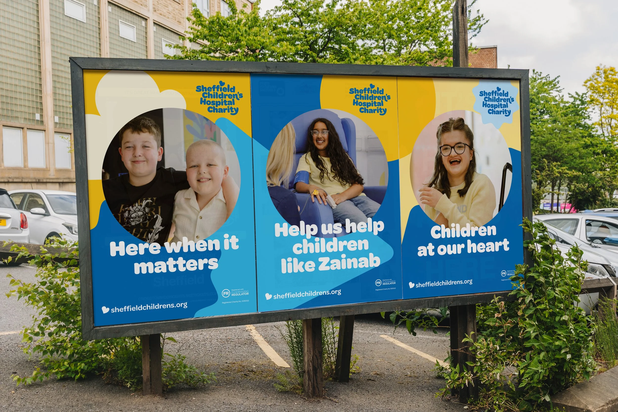
There was a lot of familiarity and positivity around elements of the existing brand, especially its recognisable blue and yellow colour palette. We kept the core colours and introduced a supporting palette to give the charity flexibility when they needed to speak to different audiences.
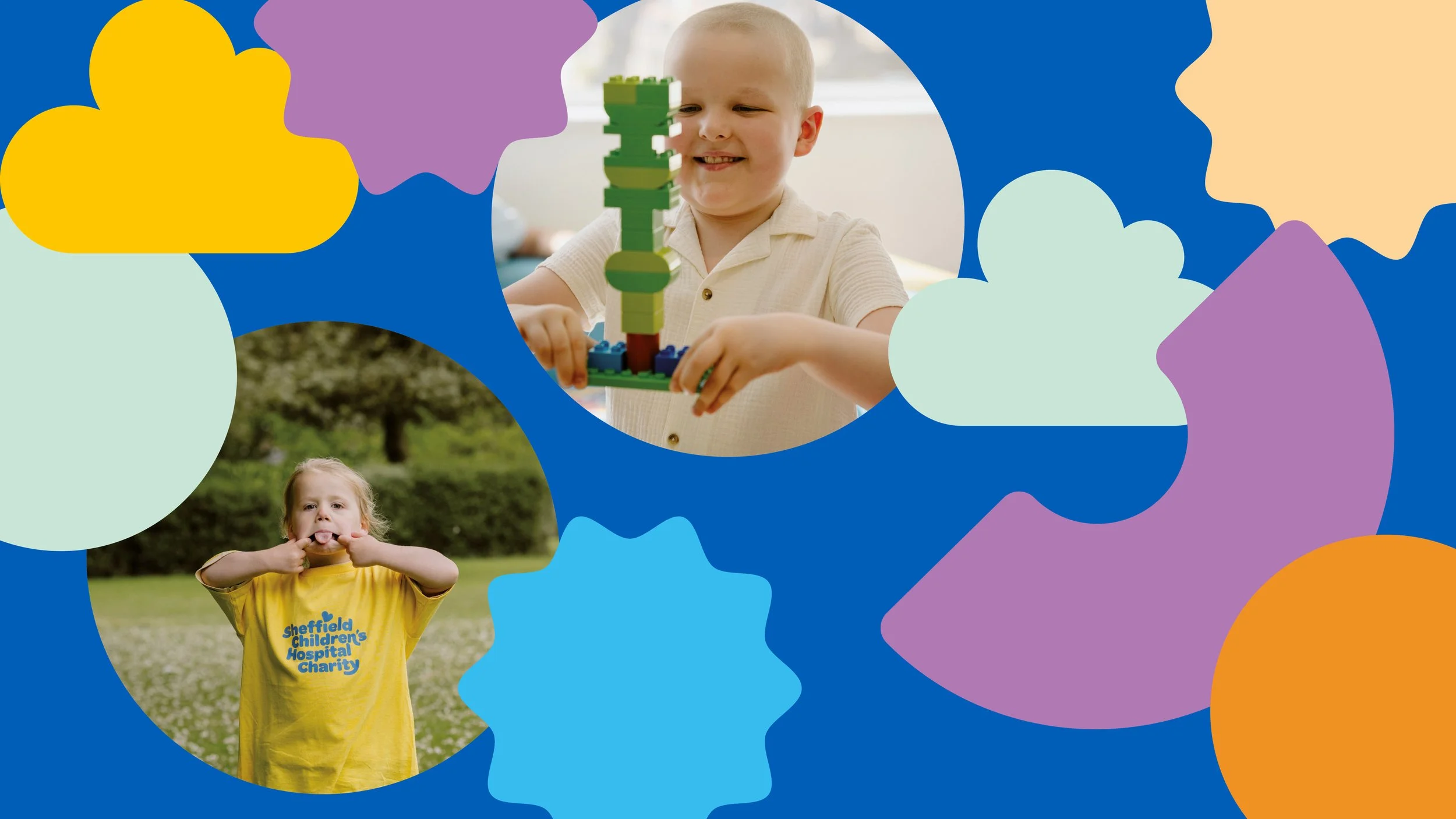
We created a collection of brand shapes that reflect the variety and warmth inherent to the charity’s work. The shapes inject a sense of playfulness and give the in-house design team additional flexibility for the multitude of projects and campaigns the charity create.
We also established a more distinctive typography, that enhances accessibility on online platforms.
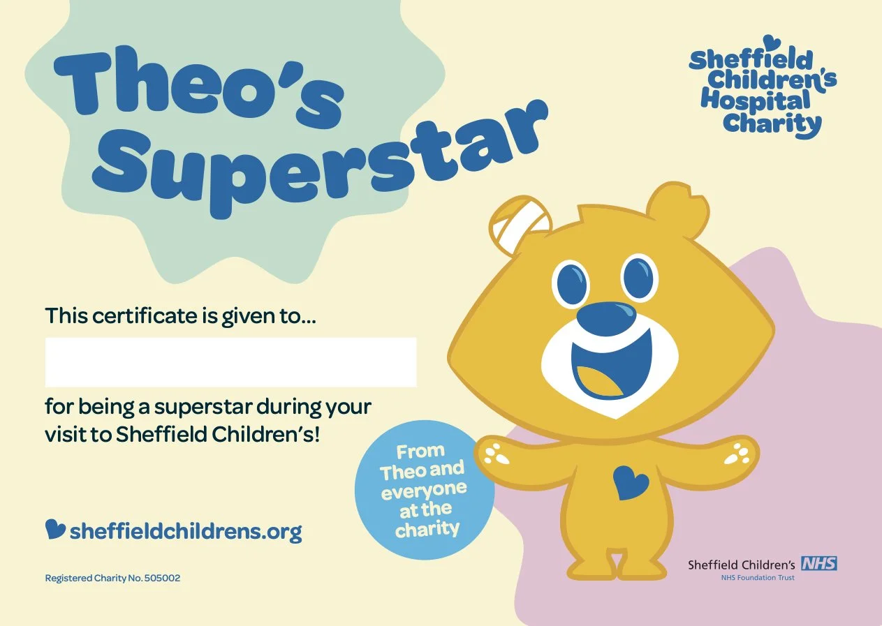
Theo the beloved bear and charity mascot is sticking around, of course. He’s had a little upgrade, and now proudly wears Florrie’s heart emblem on his chest.

Hospital life
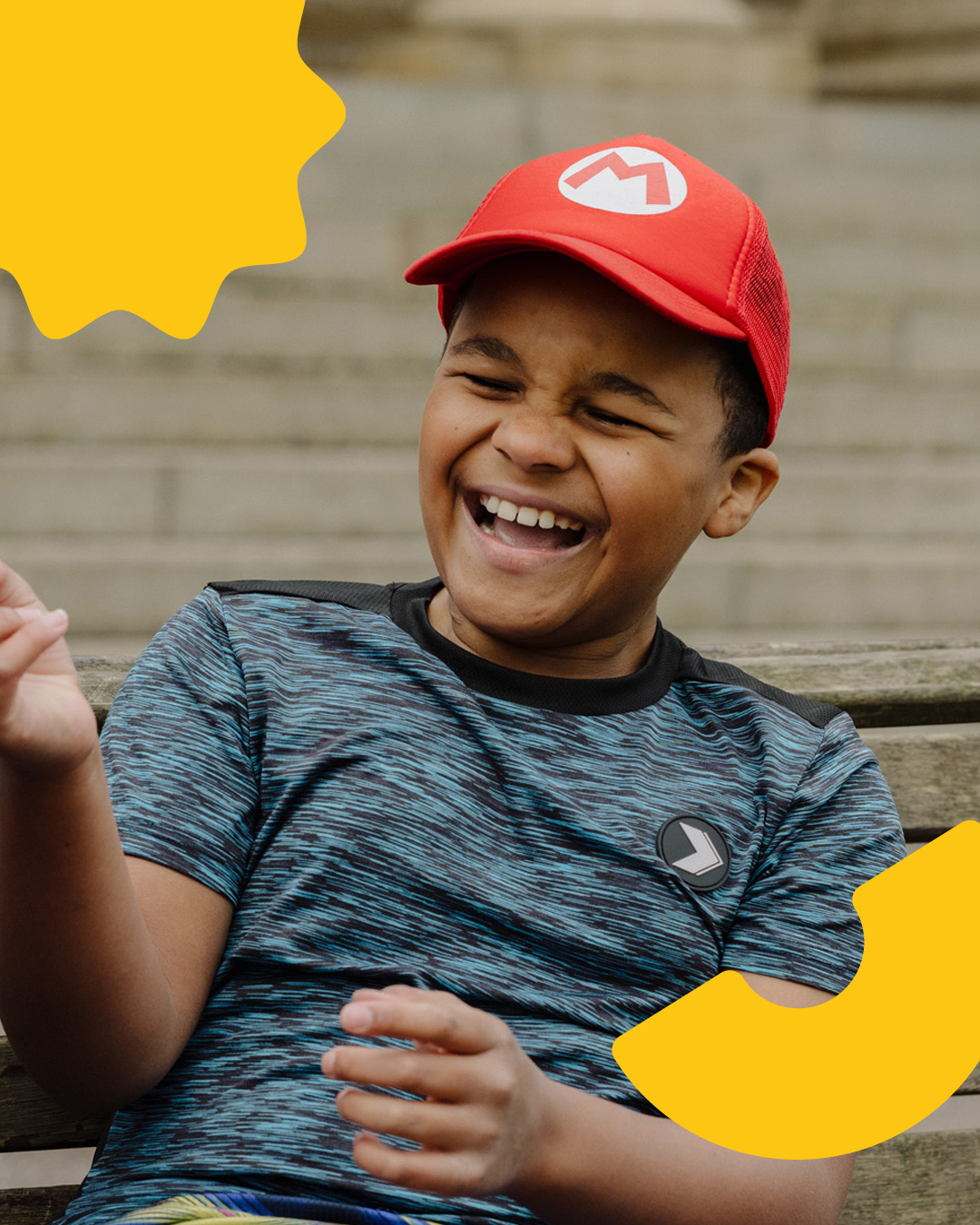
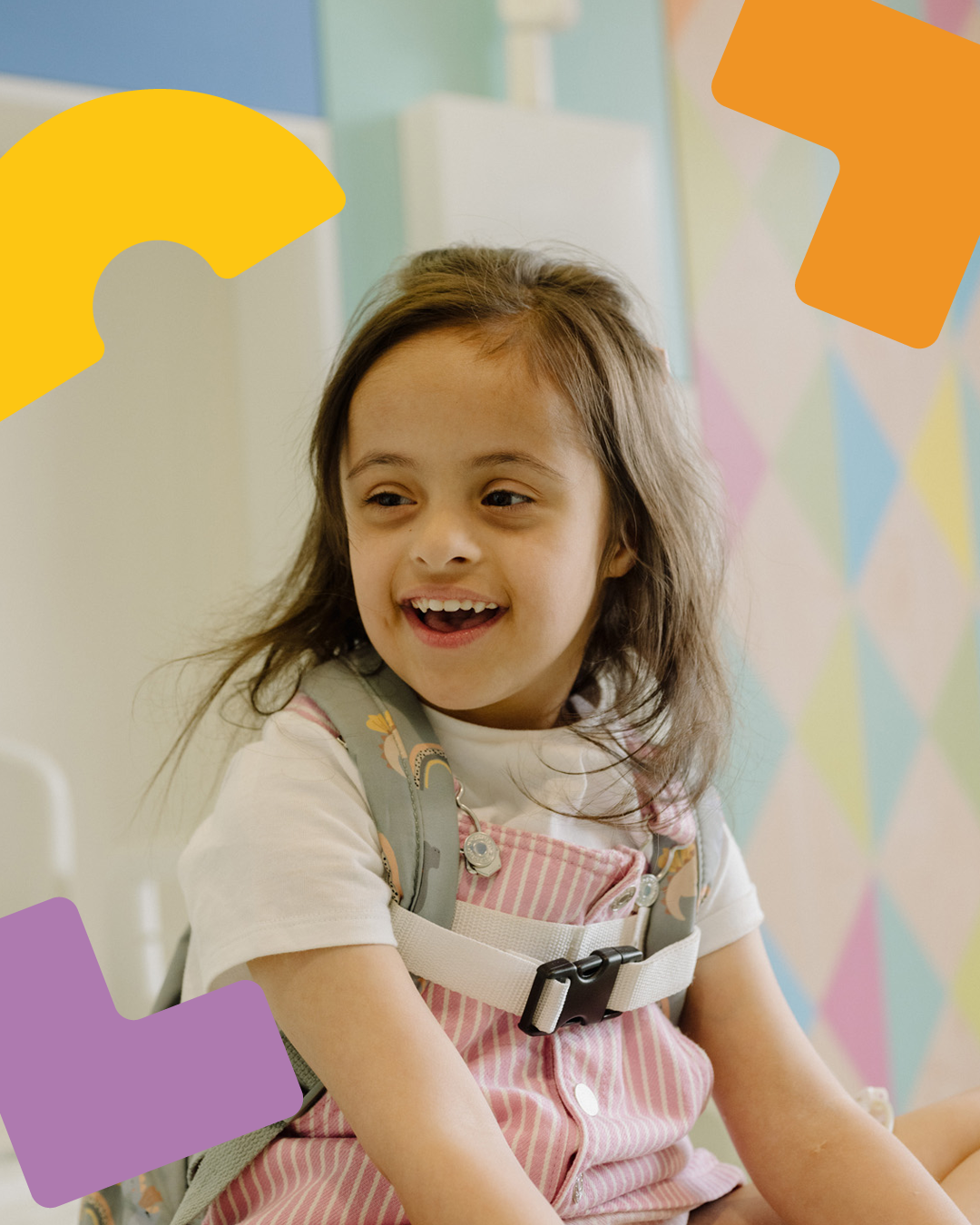
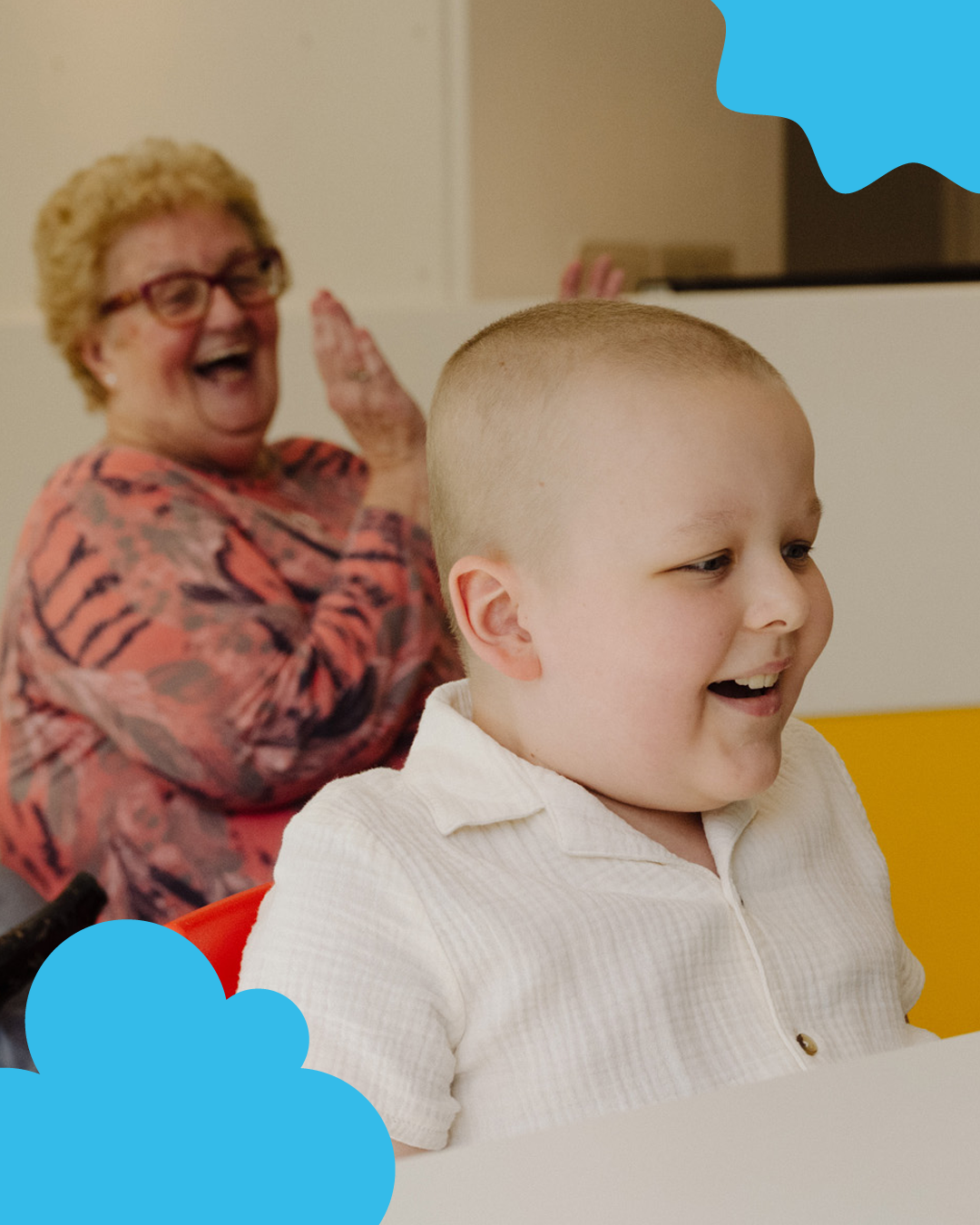
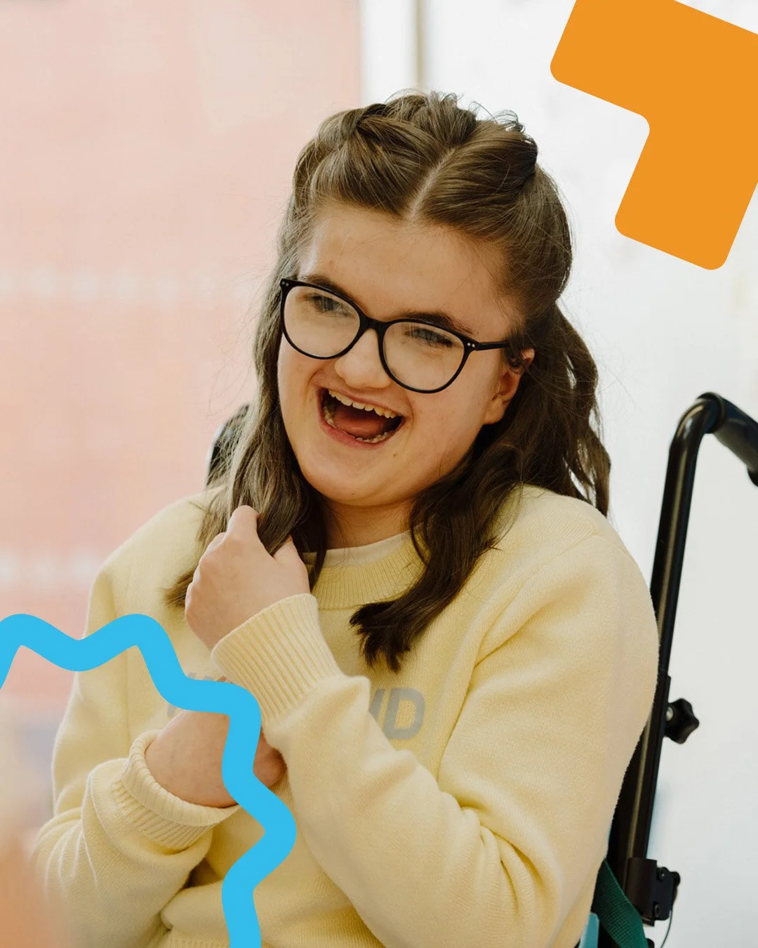
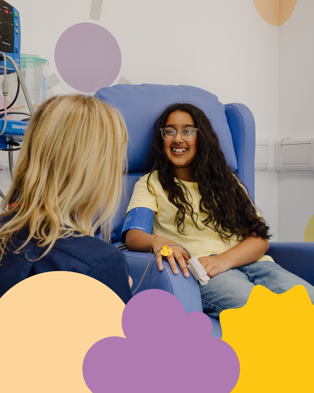
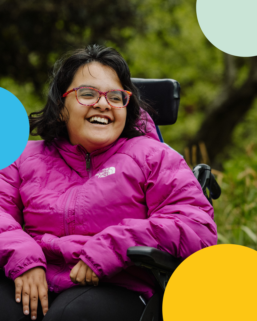
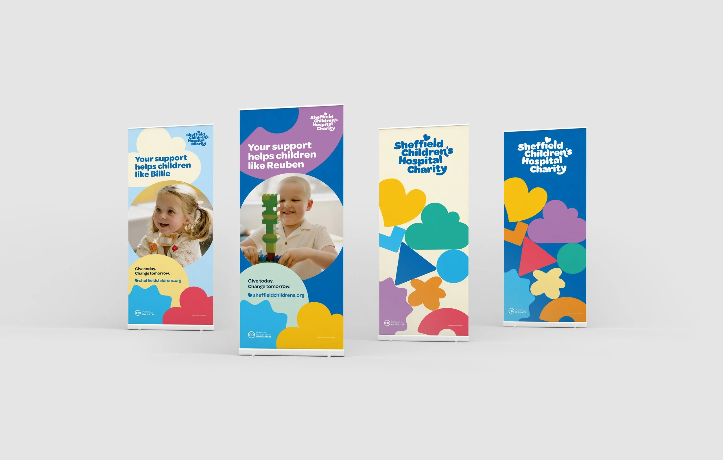
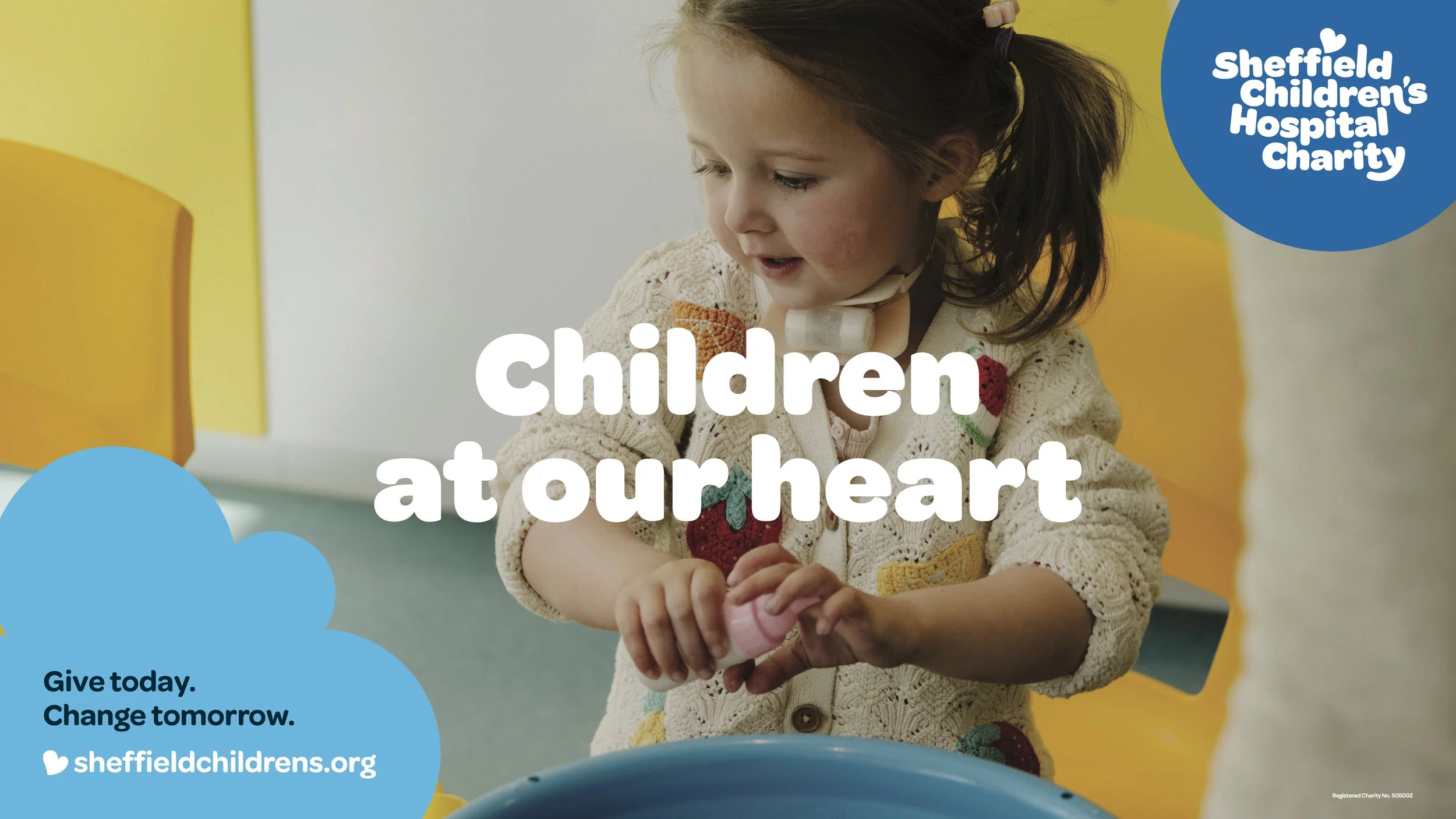
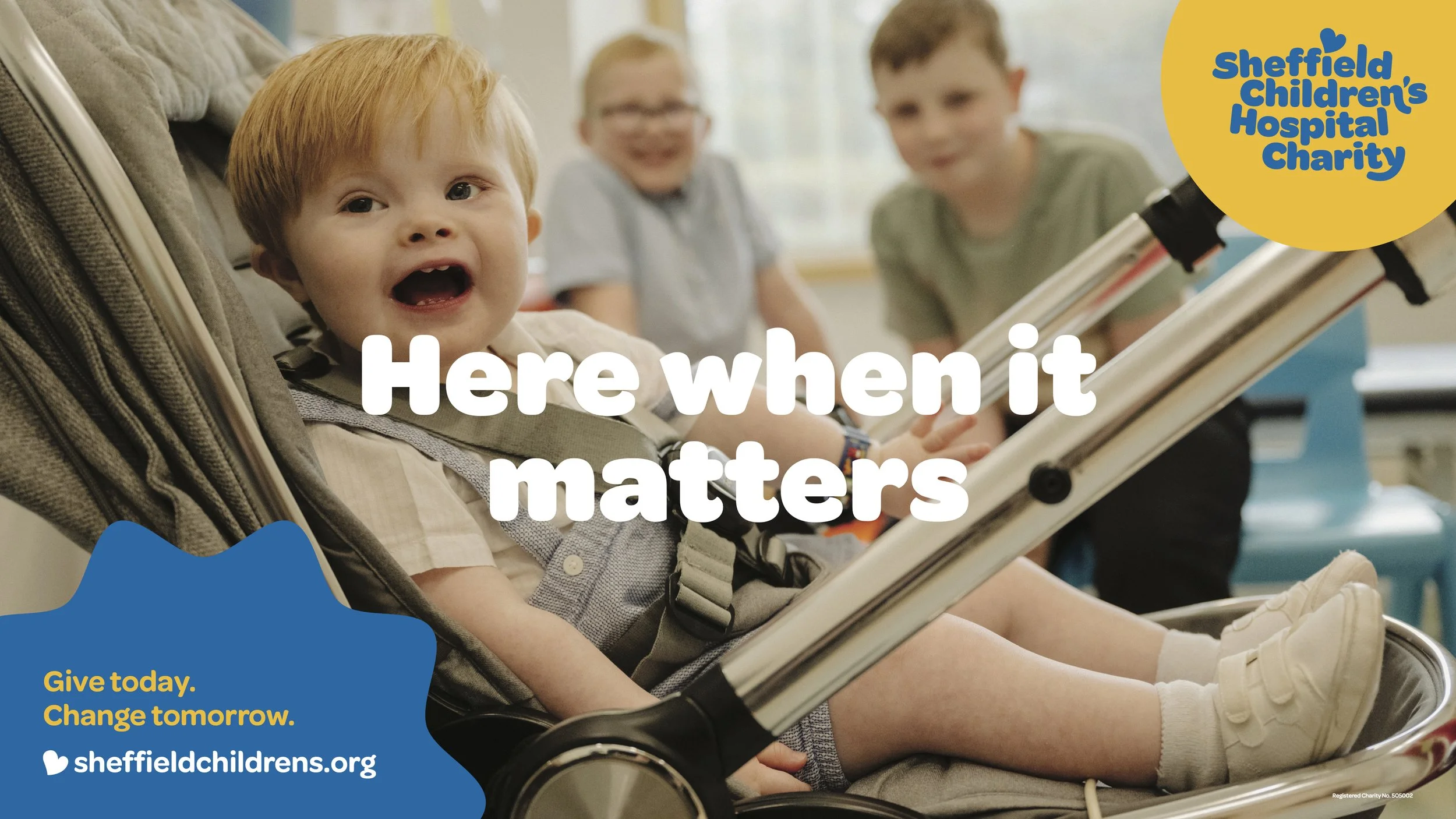
Imagery is vital to the charity’s storytelling. We knew we wanted to create emotional connection without falling into cliché. So we brought in brilliant photographer Owen Richards to capture real moments among patients, family and staff, creating a new suite of photos that will hopefully genuinely resonate with audiences and supporters.
It’s these children, and 1000s like them, that drive the charity. Their desire to make life a little easier for them and their families is at the heart of everything they do, and it was important to show that authentically – we’re thrilled with how Owen has captured the spirit of each young person.


Messaging
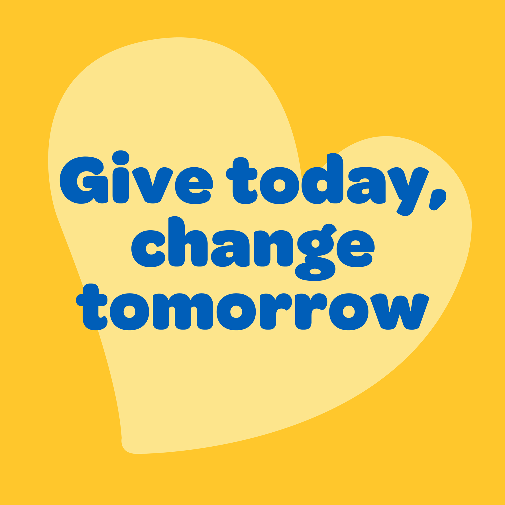
The charity were clear that messaging should be positive, focusing on the support and care they give to children and families during difficult times. Our writer Kat worked with the team on a range of messages that underpin their communications, and reinforce their purpose.
Bringing it together
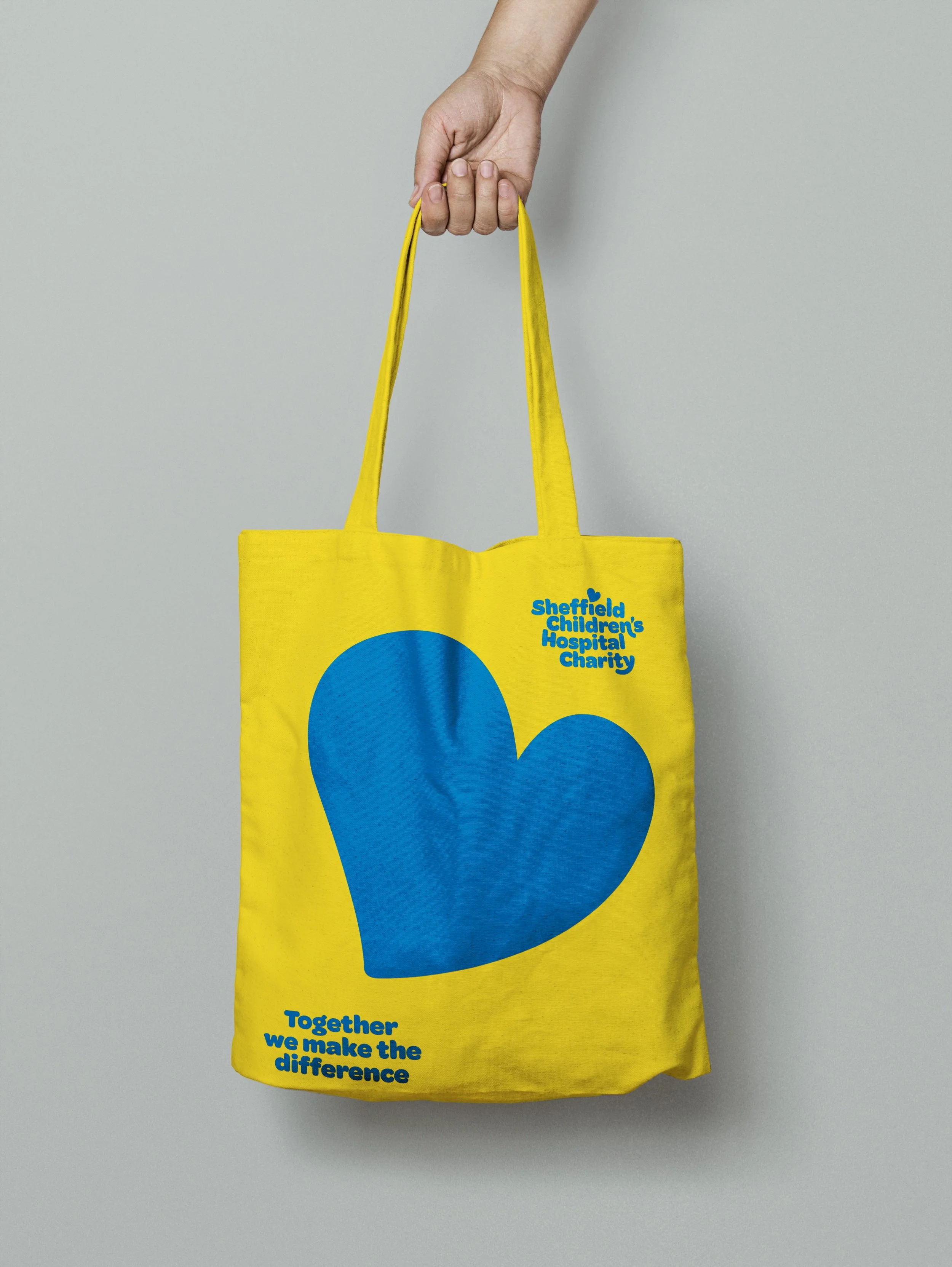
It’s really exciting to see the refreshed brand now rolling out across all charity touchpoints – including a new website, fundraising collateral and merchandise.
We’ve created an extensive brand toolkit to ensure the in-house team have all the tools they needed to create cohesive communications.
Sub-brands
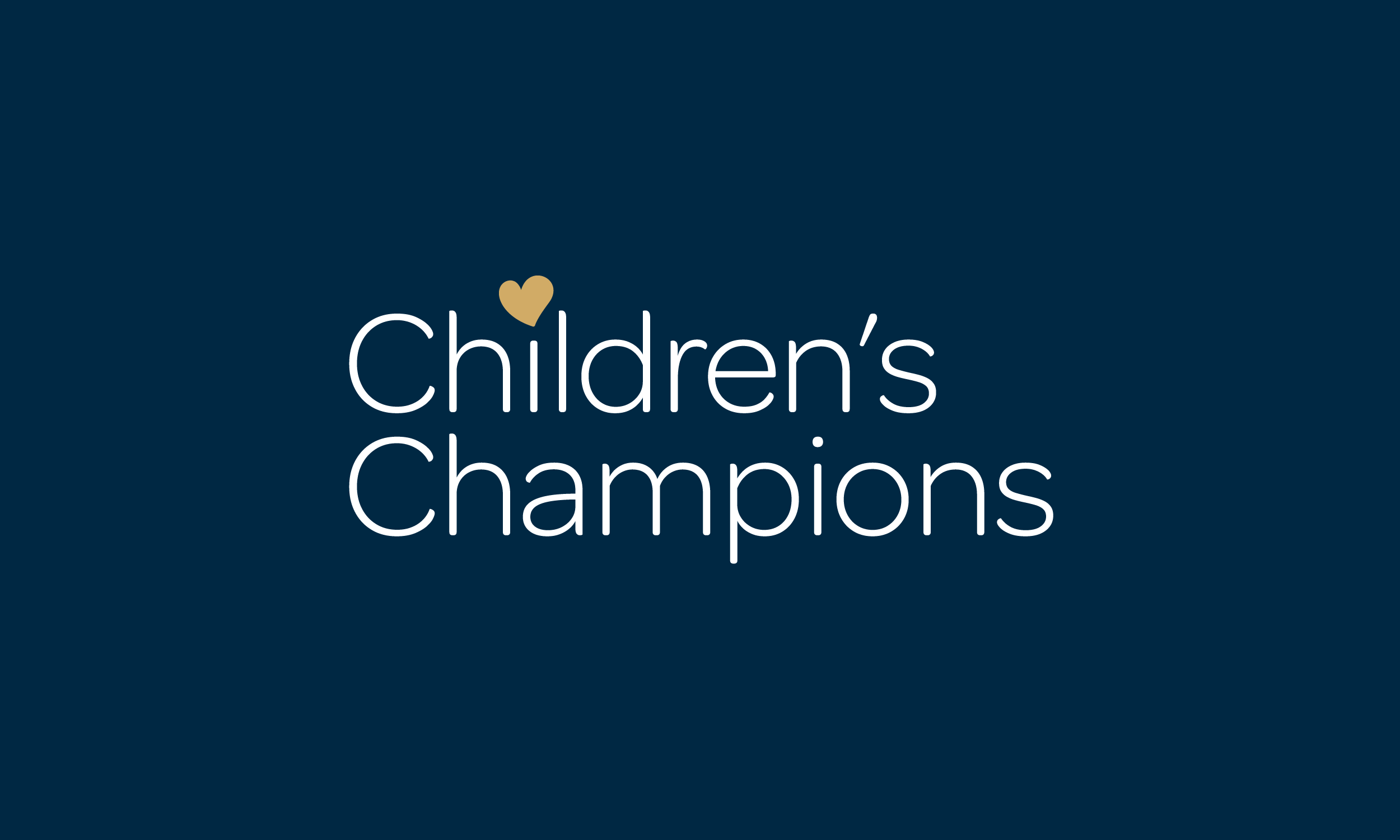
The charity speaks to a range of audiences, and the brand has to have enough flex to be serious when needed. A successful sub-brand for the charity is Children’s Champions, a membership club for donors who give regularly and have contributed to vital research and state-of-the-art facilities at Sheffield Children’s.
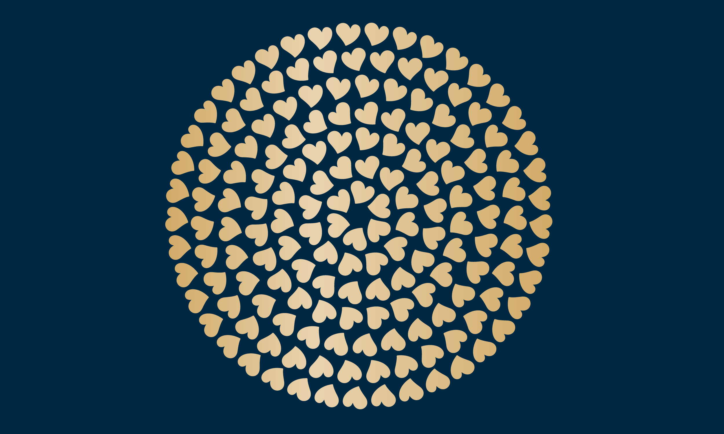
The identity for Children’s Champions needs to feel exclusive so we’ve upgraded the charity’s heart emblem and introduced gold elements to ensure the club has an extra bit of sparkle.