In-Situ
To do
Mostyn is one of Wales’s leading contemporary arts centres, based in Llandudno on the north coast. We worked with their team on a full brand overhaul. We devised a fresh look that works across print, digital and signage. We also worked on tone of voice to help Mostyn better communicate their purpose and values with their wide audiences.
Our Glenn is from north Wales himself, so this project was a particular dream for him.

Creative process
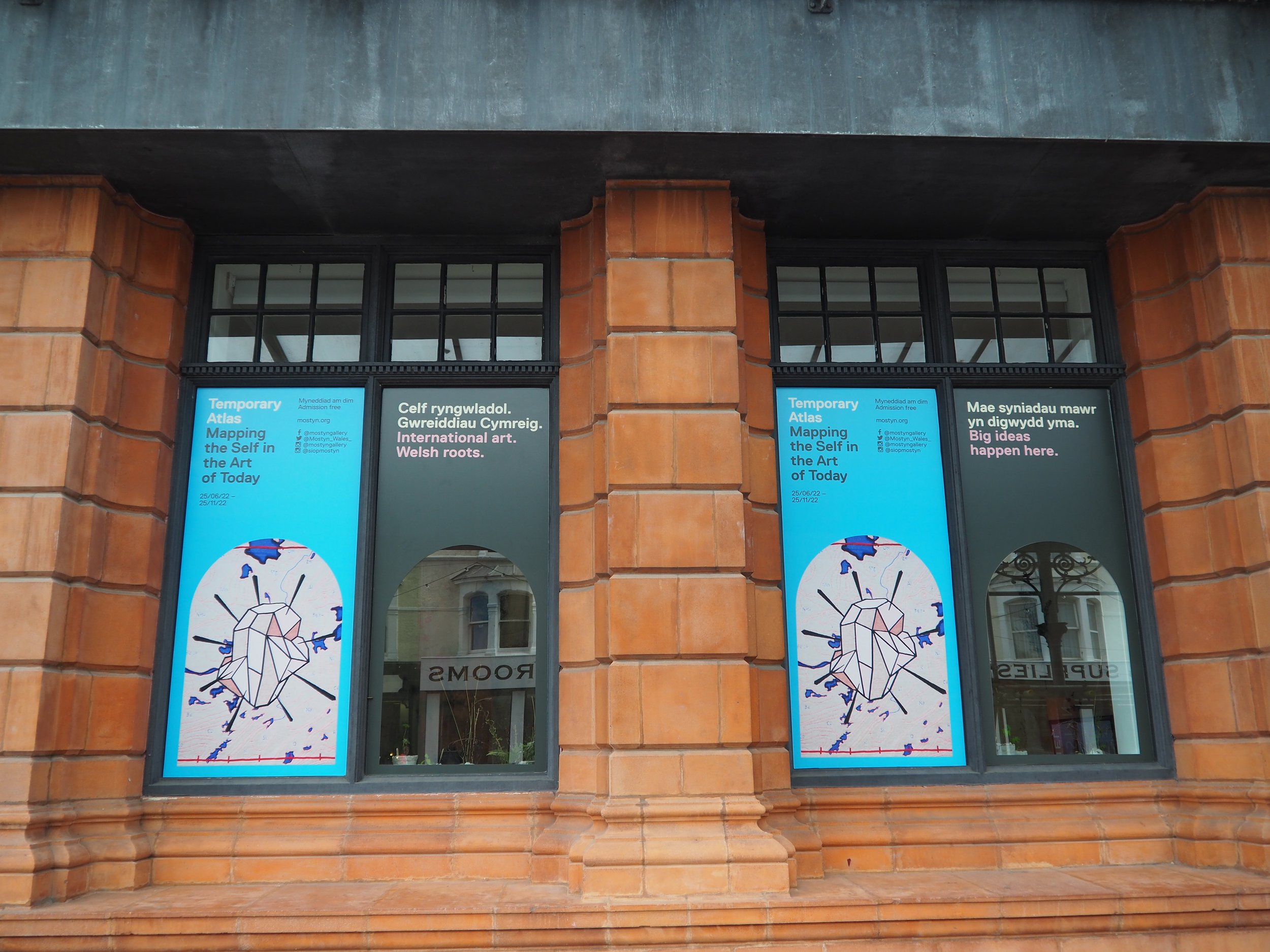
What makes Mostyn truly unique is its combination of the contemporary and the traditional. Behind its beautiful listed Victorian red-brick facade lies a modern concrete lightwell and cutting-edge international art. All in a classic seaside setting.
We took visual cues from the building, presenting them in a contemporary style. Drawing on the shape of its windows, we introduced the motif of an archway. We applied it as a graphic in signage and as a framing device in digital and print marketing. It sits in harmony with our new wayfinding signage, in a matching shade of green.
International art. Welsh roots.
Together with the gallery’s staff team, we delved deep into what Mostyn means to them and what it represents to its visitors.
It turns out Mostyn is many things to many people. Mostyn’s galleries attract an art crowd from around the world. Its engagement programme is very much rooted in its coastal community. Its cafe is a hit with gallery-goers and seaside tourists alike. And its shop celebrates creative talent from Wales and beyond.
We wanted to help Mostyn show their pride in each of these areas. We wrote tone of voice guidance, hanging it on key messages for use in signage and marketing, including:
International art. Welsh roots.
Big ideas happen here.
Open to interpretation. Open to ideas. Open to all.
Shopping inspired by art, from our community of creators.
Coffee and cake with a sea view… at table 3.
Since completing the rebrand, we’ve continued to work with the team on a strategy to place Mostyn as a cultural anchor for the region.
“Quote”
Quote name
