Tooley Foster
A new name in architecture with over 120 years’ experience
Tooley Foster is an architecture practice with a big history. Founded in 1892, Tooley Foster blossomed in an era of progressive thinking around education and health. Specifically the birth of the NHS and a nationwide school-building programme. Today, they work on projects across many sectors but retain a specialism in architecture for healthcare and education.
Tooley Foster commissioned us to update their brand identity. They wanted it to acknowledge the wealth of history and knowledge in the firm, while positioning it firmly as a contemporary practice.
The previous identity used a combination of initials, plus the full company name and the URL.
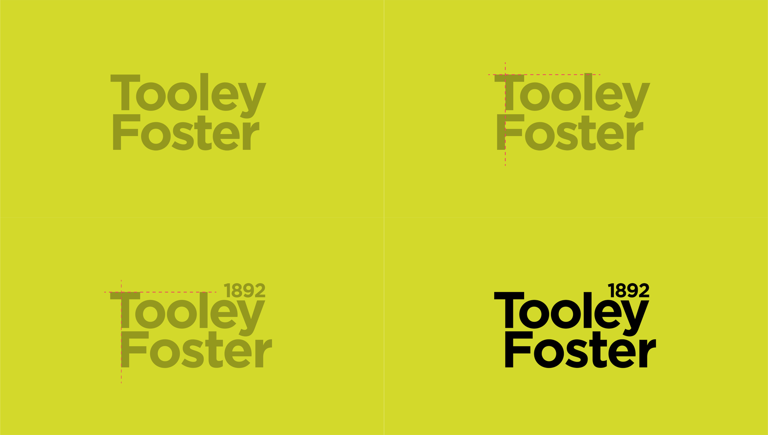
The new brand simplifies the name and introduces the foundation year to celebrate the heritage of the practice.
Logo customisation
Creative approach
Tooley Foster are at the forefront of innovations in sustainable architecture and design. A key part of the rebrand brief was to emphasise these credentials while acknowledging the practice’s history.
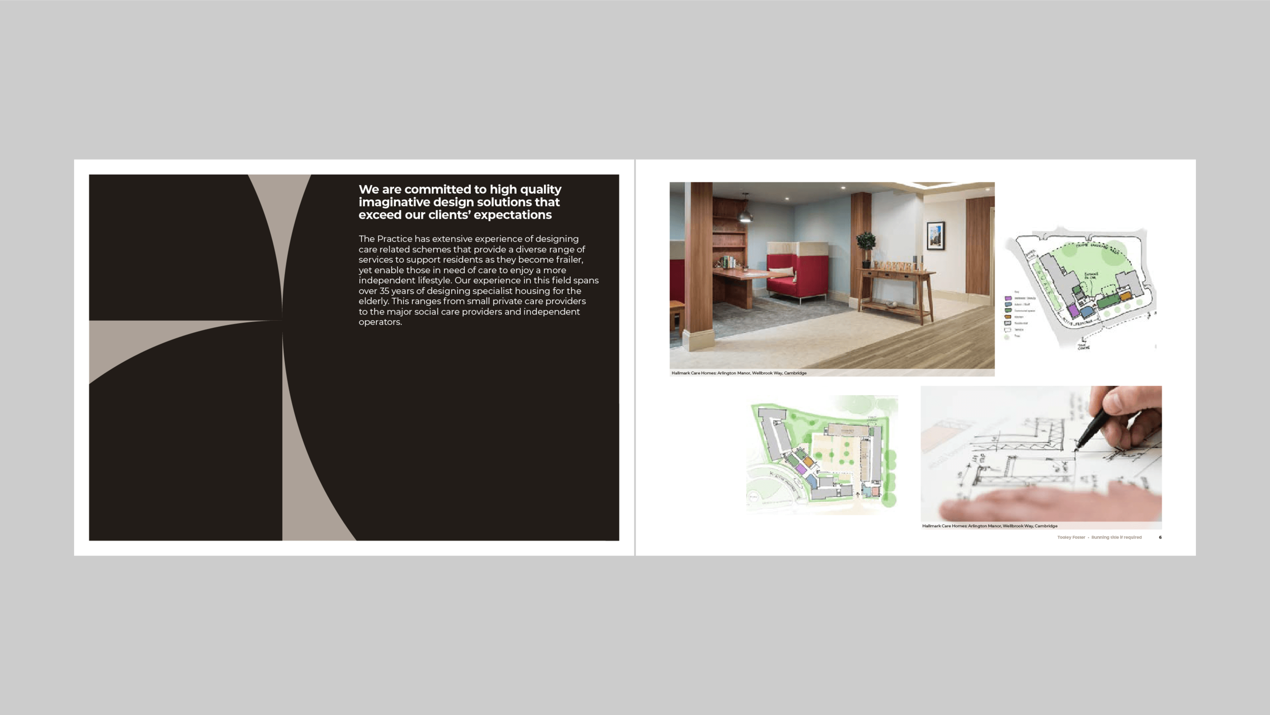
We achieved this by using a smart sans-serif font for the logo, with the founding date in superscript. A contemporary colour palette of two neutrals with a sharp green highlight kept their marketing materials professional, with a dash of flair and vibrancy. We also designed a brand pattern of geometric building blocks for use across different media.
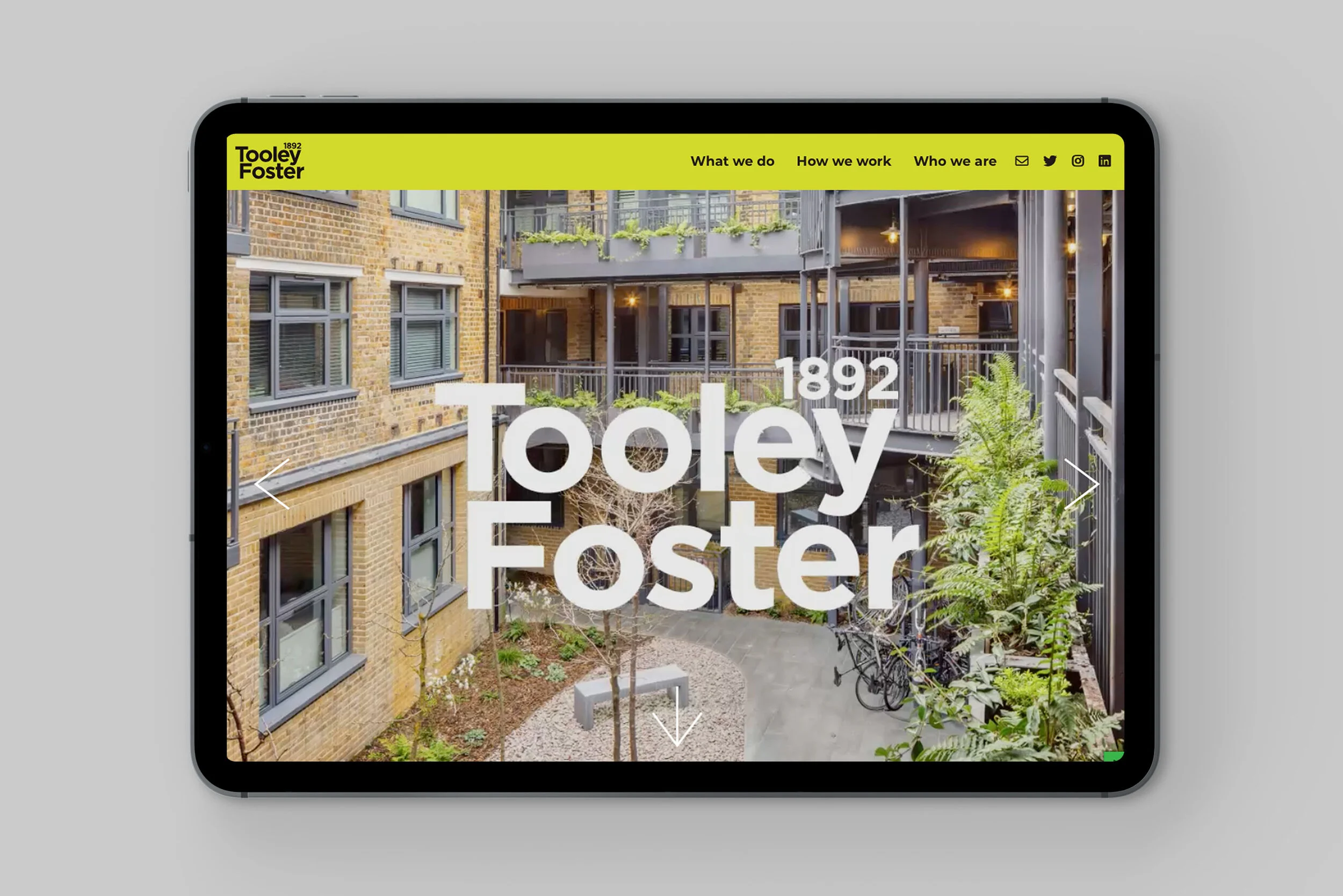
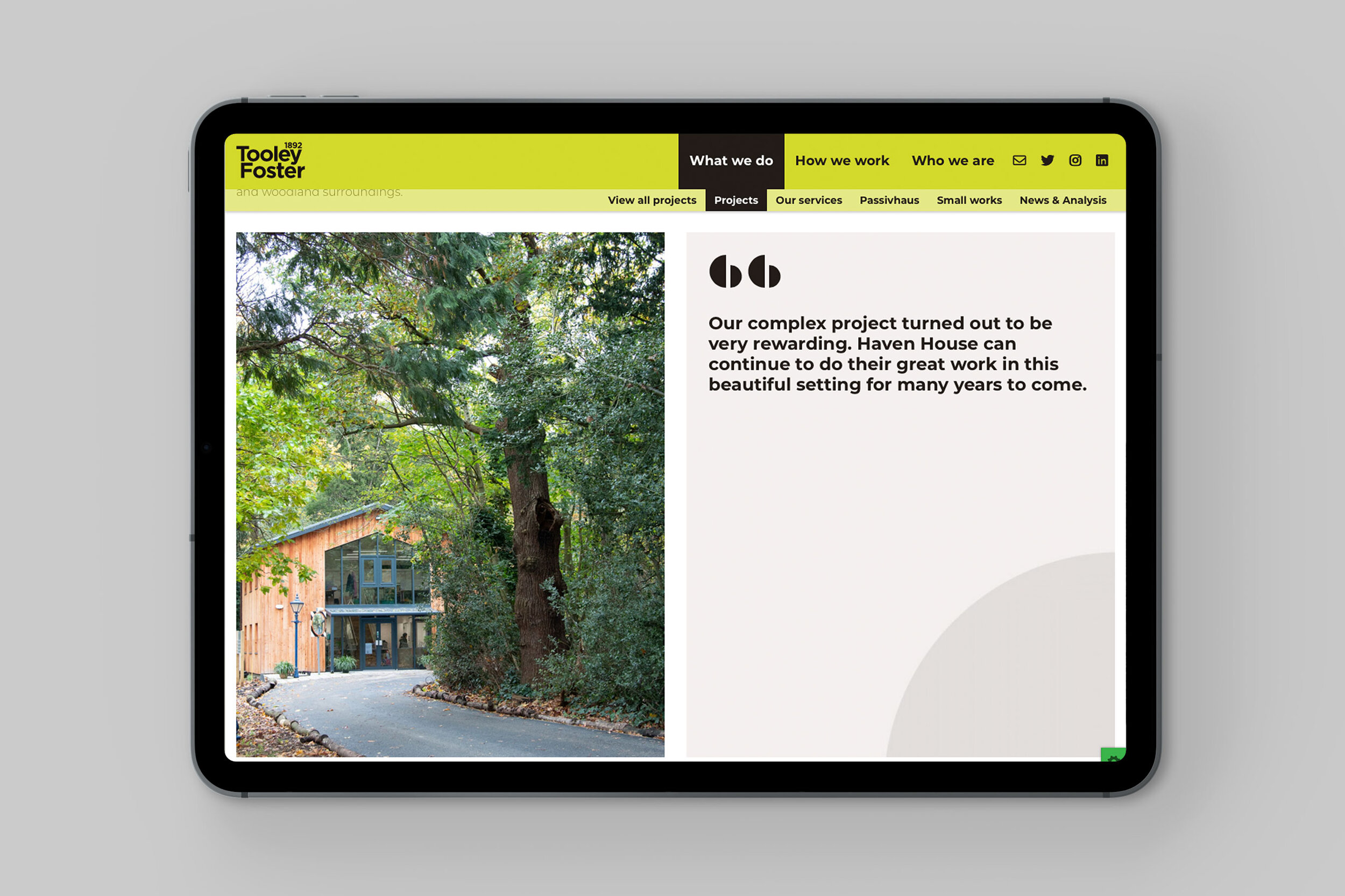
As well as a new visual identity, the rebrand included a new website, tone of voice guidance and detailed brand guidelines. We also handled the roll-out of assets for print, digital and socials.


We worked closely with Tooley Foster to distill their values into a series of brand messages. We helped them to develop a tone of voice that conveys the ideas and values of the practice.
We wrote a tone of voice guide to help the team write effective copy. It sets out the central idea of the brand and the values that underpin it, with tips on how best to use language to convey these ideas and values to audiences.
“The new identity has completely repositioned our practice. Visually it’s very smart and professional. We love how Eleven introduced our founding date into the logo, it reinforces our heritage in a contemporary way, and our new colour palette strikes the perfect balance.”
Joe Kaler, Marketing Manager, Tooley Foster


