Shetland Arts
Our most northerly client
Shetland Arts bring people together through creativity across the Shetland archipelago. They run a cinema, theatre and gallery, host artist residencies, and offer all kinds of creative workshops, courses and commissions.
In 2025, as they approached their 20th year, the team redefined their mission to focus more explicitly on their social impact. To solidify this shift, they invited us to work with them on a comprehensive rebrand.
Destination: Shetland
In a first for Eleven, our client visit for this project involved not just a train ride but an overnight ferry. Our Claire and John packed their bags and, 24 hours after leaving Sheffield, landed in Lerwick.
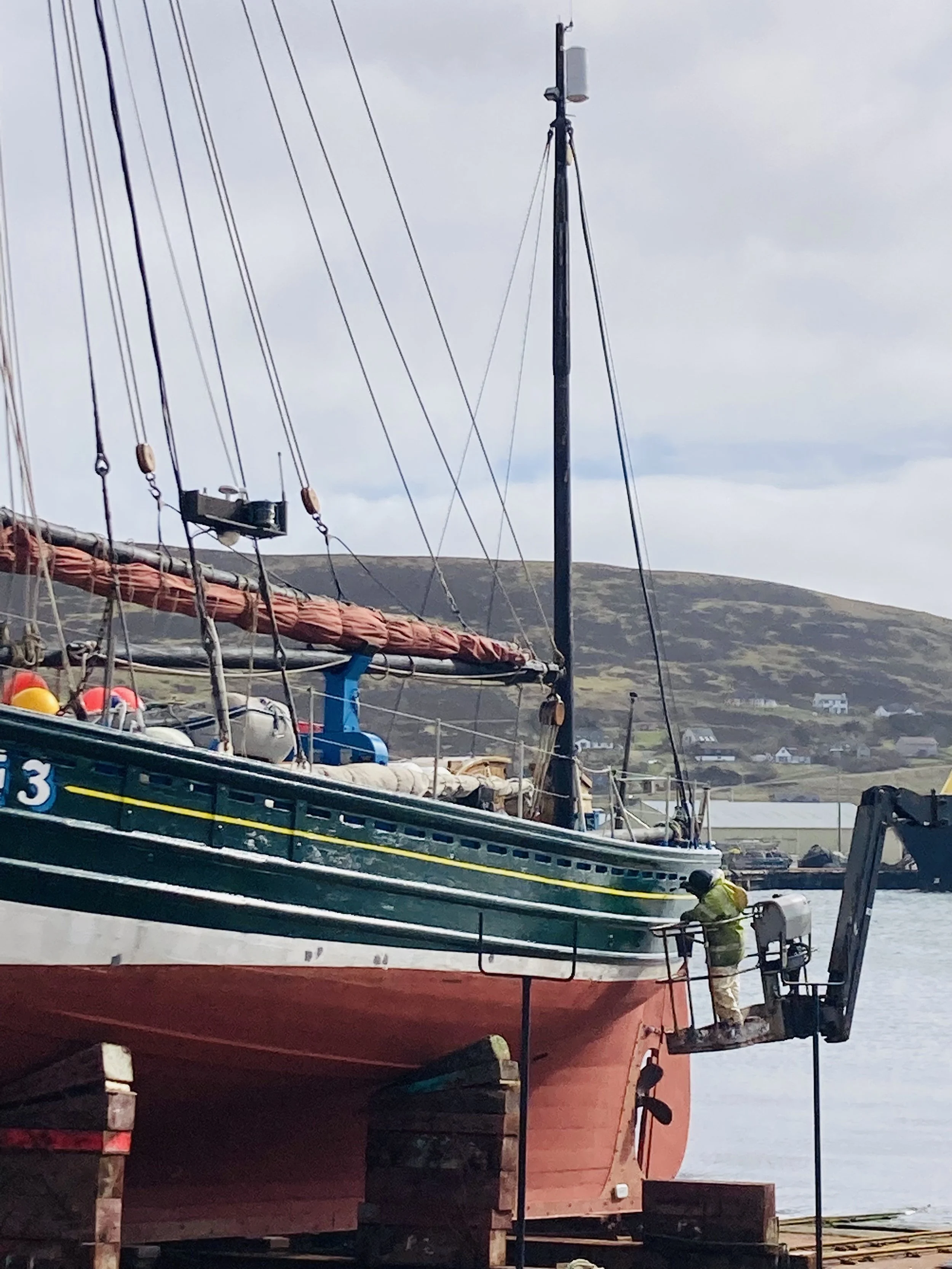
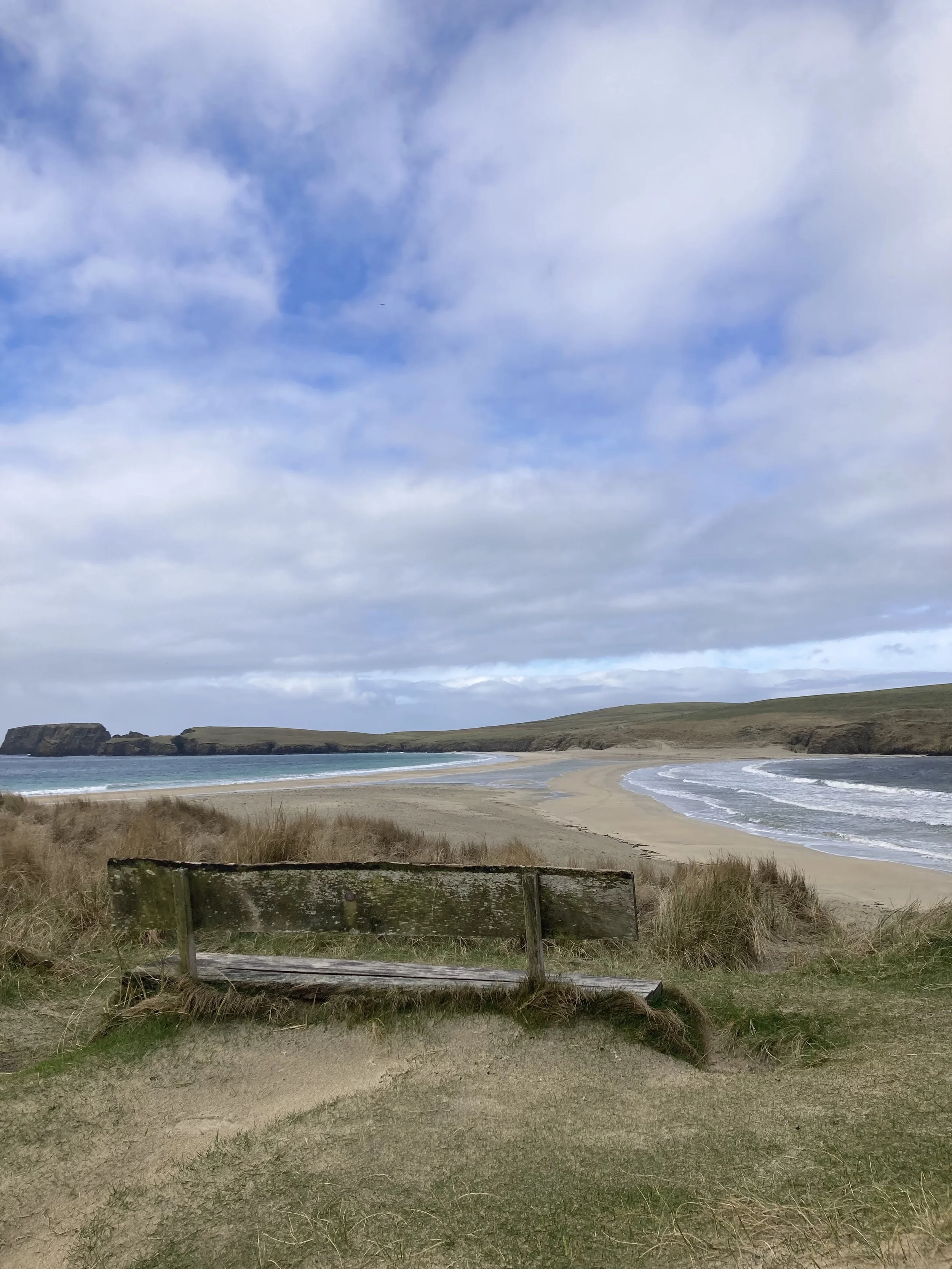
While stretching their legs, they got a feel for this beautiful place – the awe-inspiring landscape, the pride, and the threads of history, tradition and culture that connect the isles. They spent time at Shetland Arts’s flagship venue Mareel, a cinema and arts centre, with windows looking out onto seals bobbing by in the North Sea. While they were there, they shared initial ideas with the team and got to know the people and passion that drive the organisation.
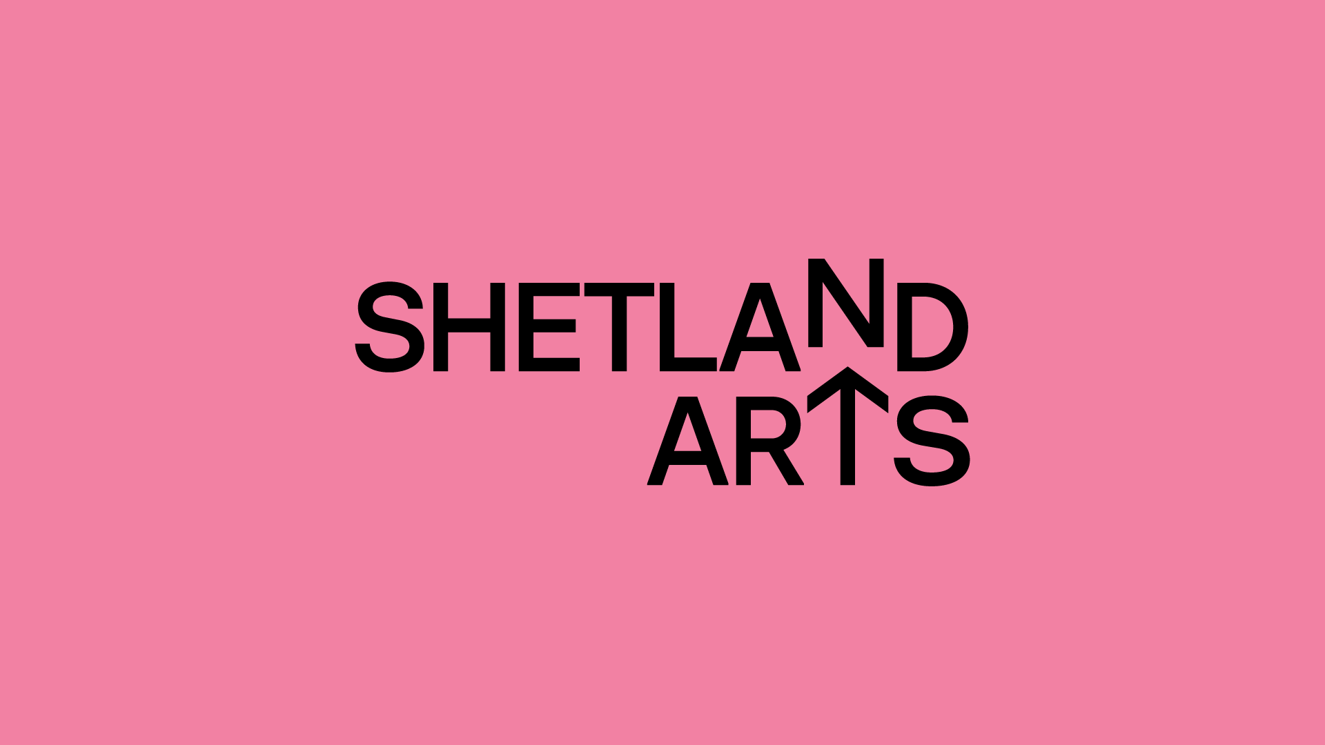
A simple twist on the letter ‘T’ creates a compass pointing north
Creative process
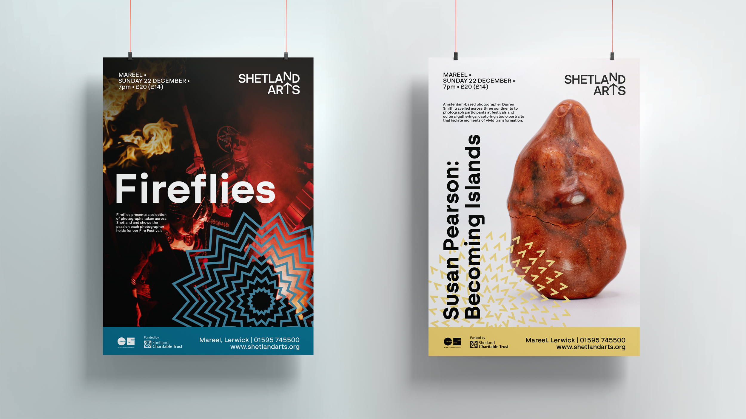
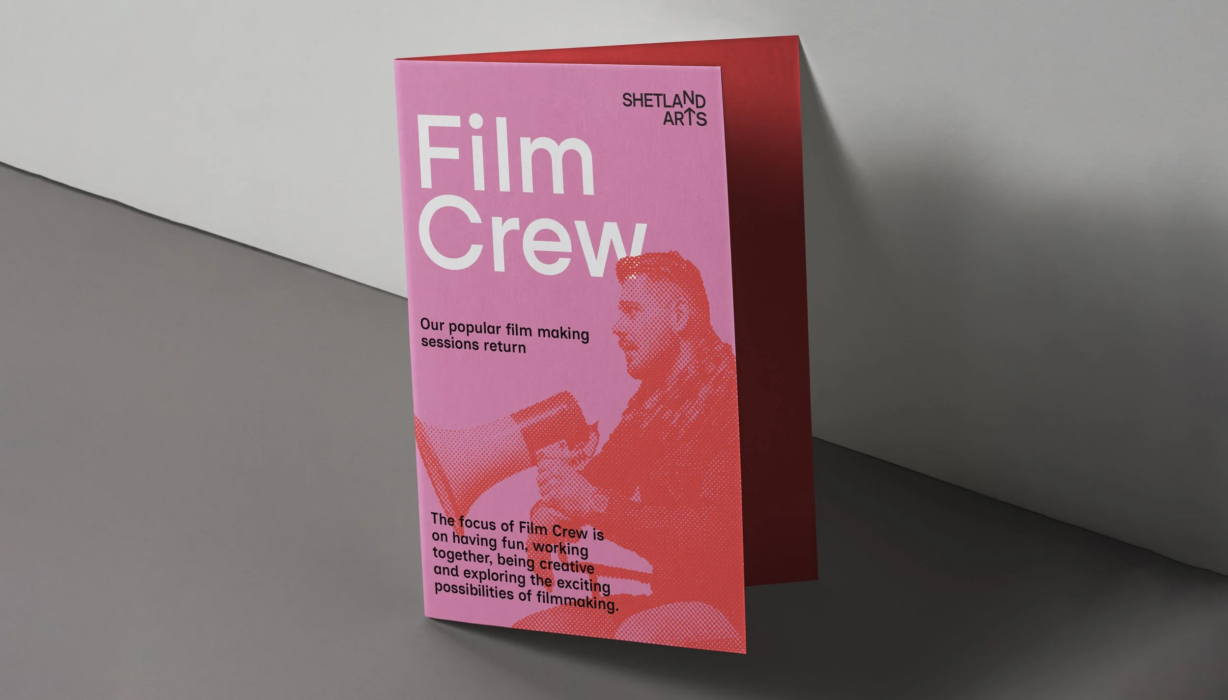
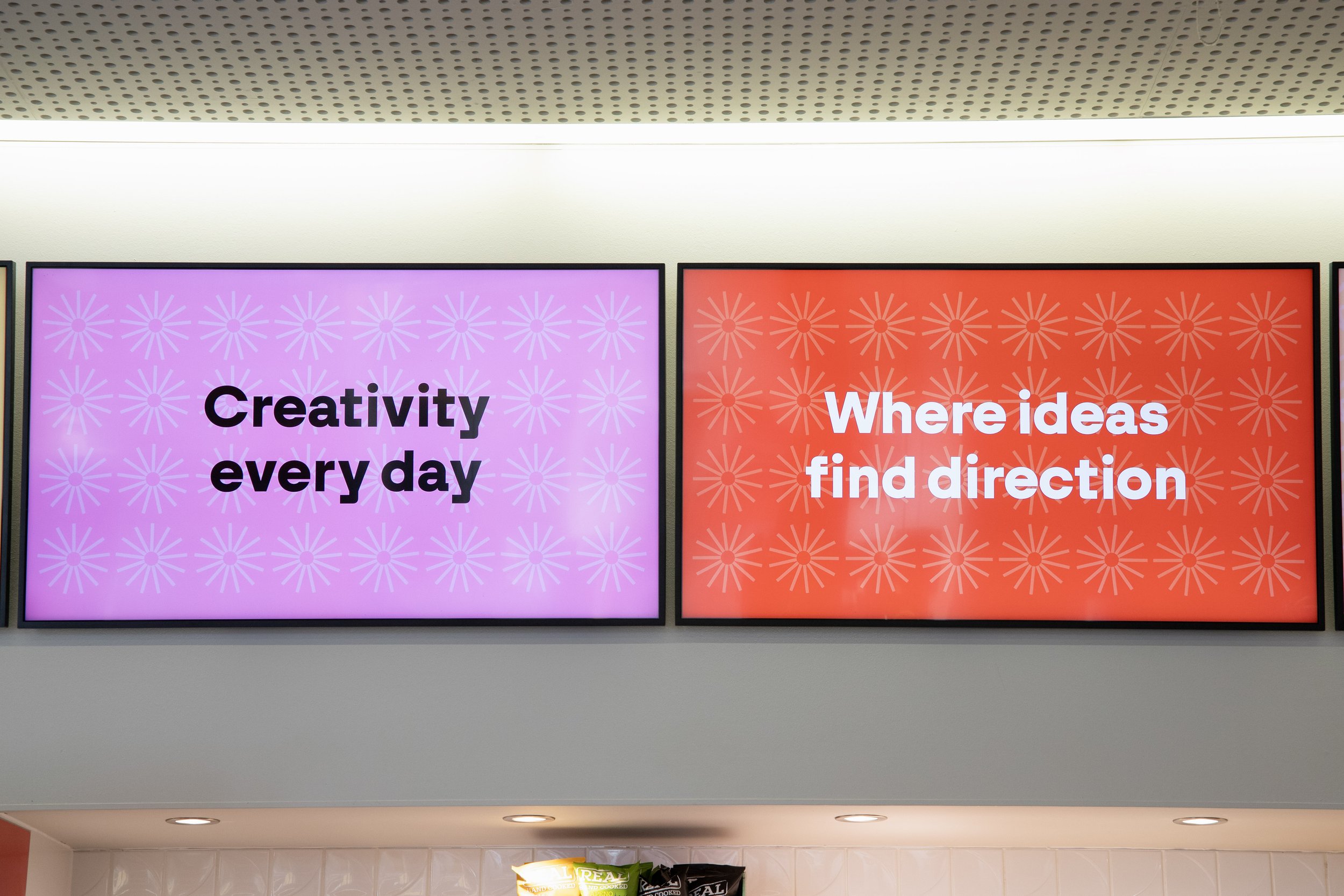
The existing Shetland Arts brand had been around for years. While there was a lot of love for it, the team were keen to enhance their visual identity to better communicate the vision and values that are taking them forward. Their priorities were to have a modern and versatile look – something that would be consistent yet flexible, that would work as a parent under which their family of brands would comfortably sit and interact.
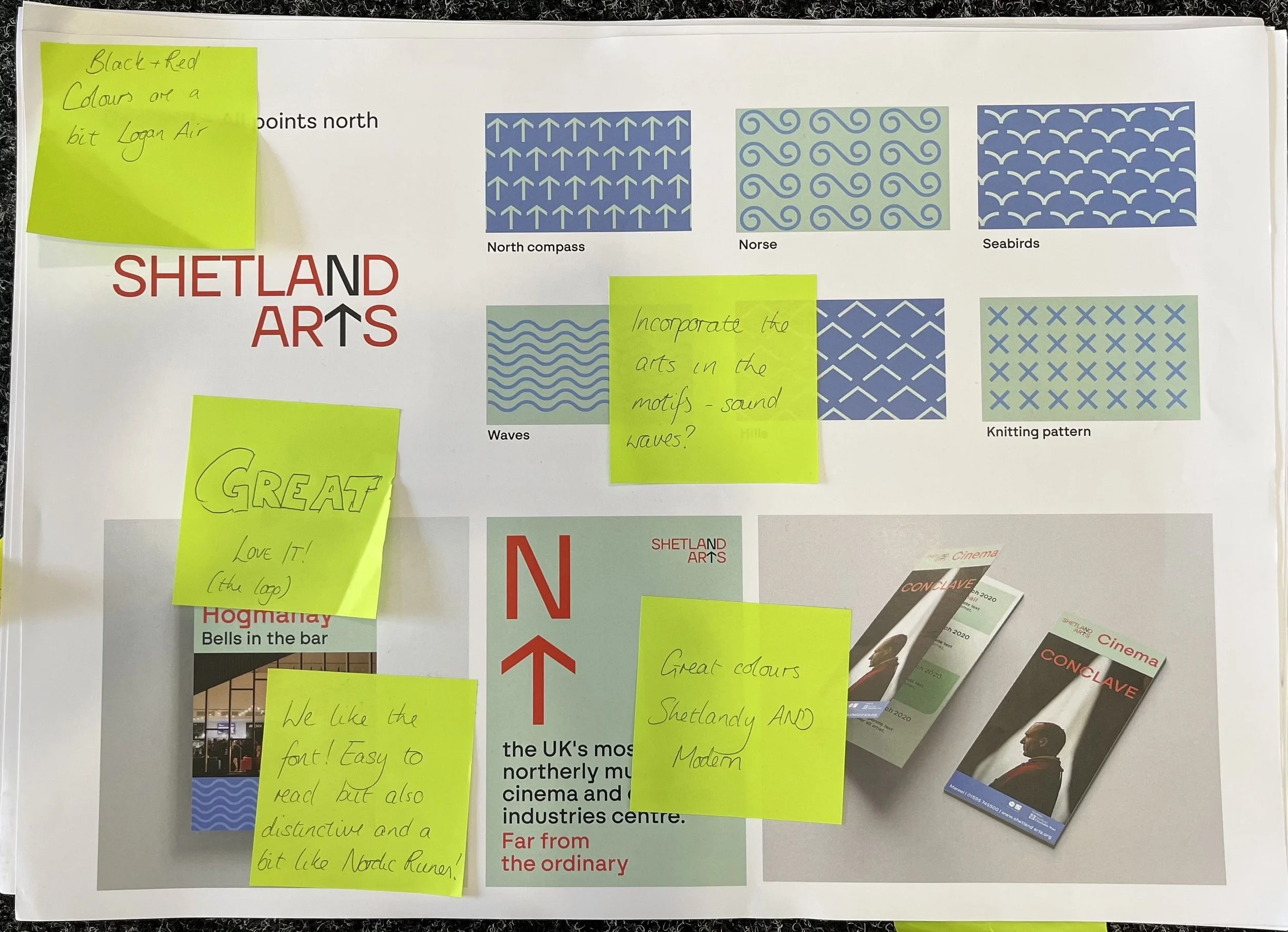
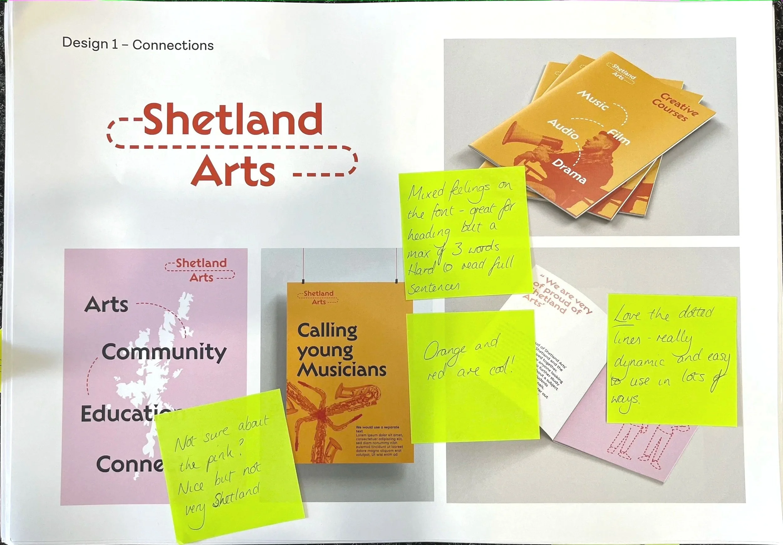
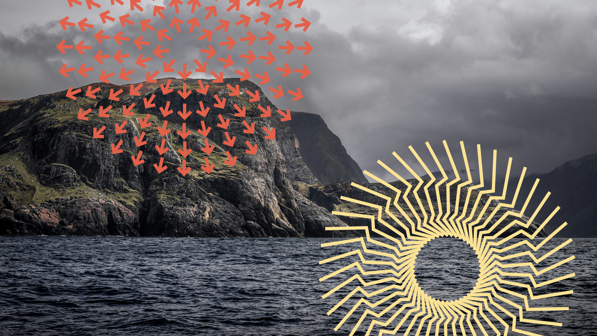
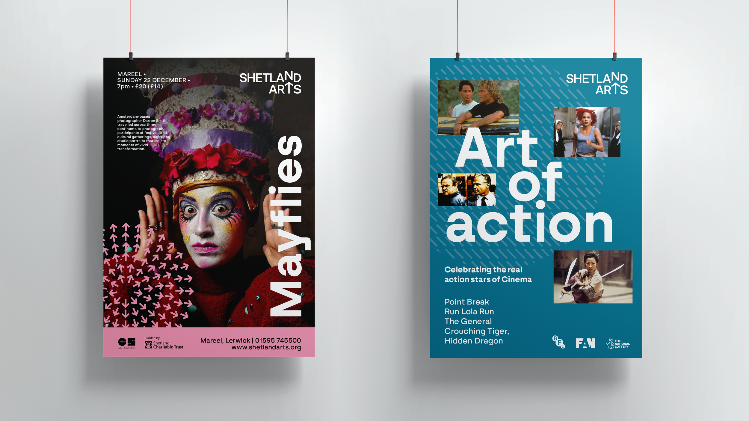
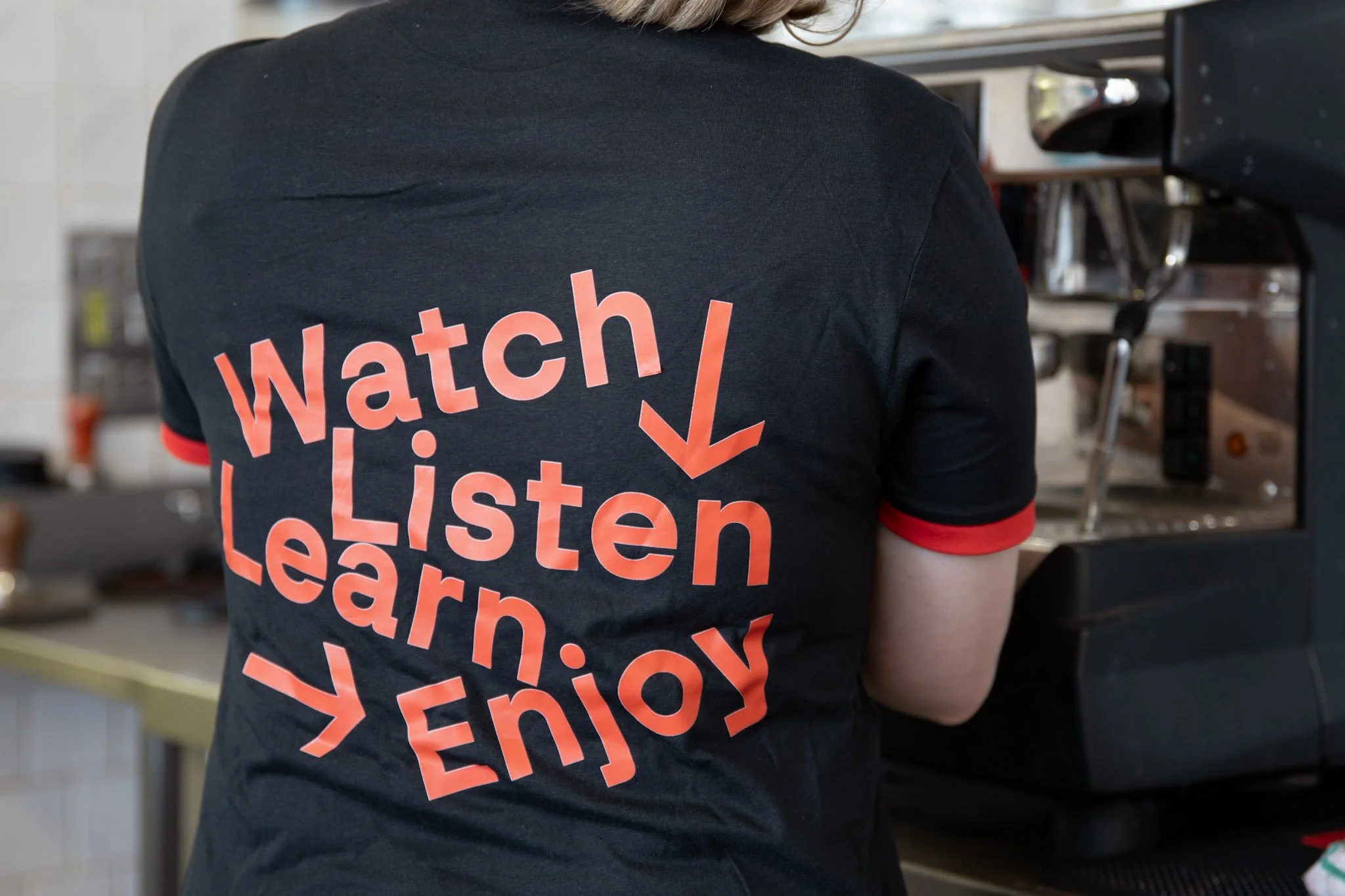
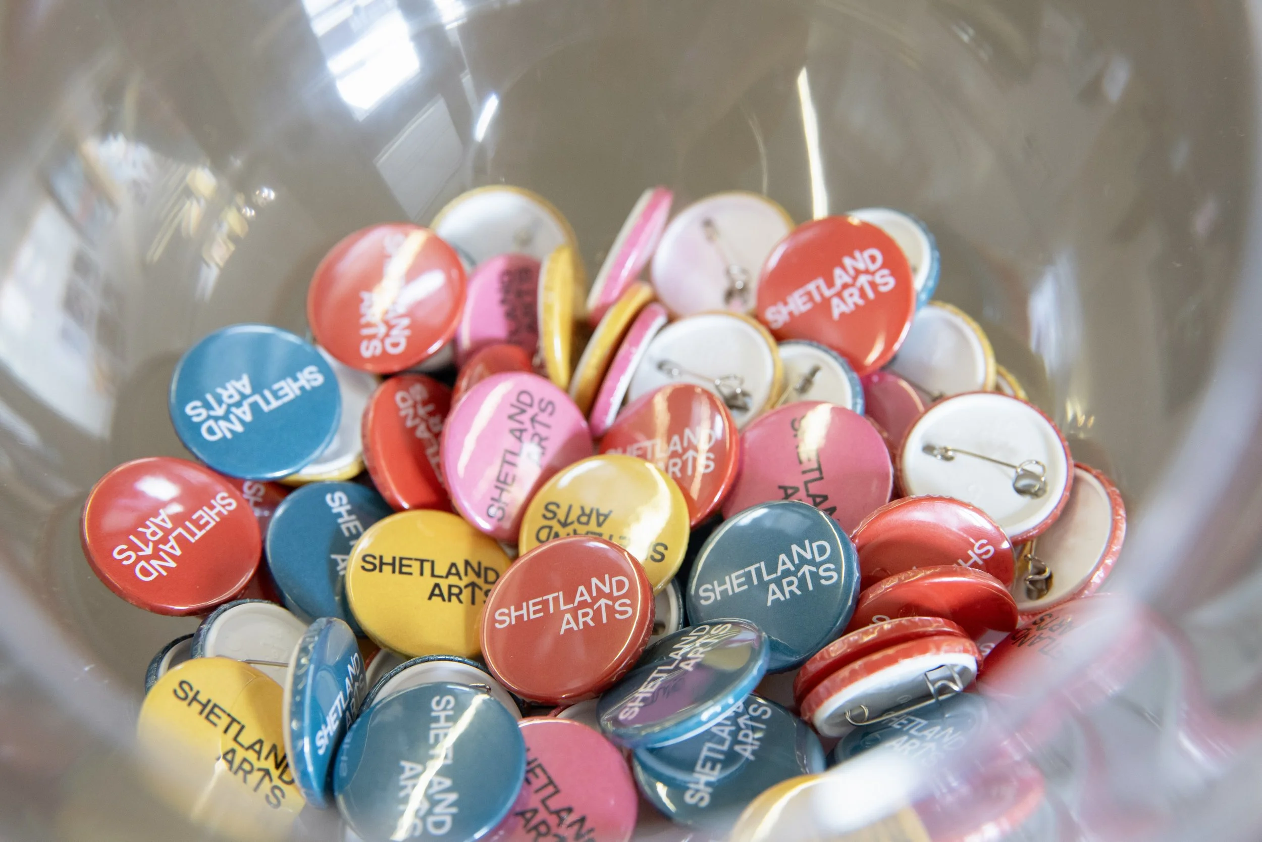
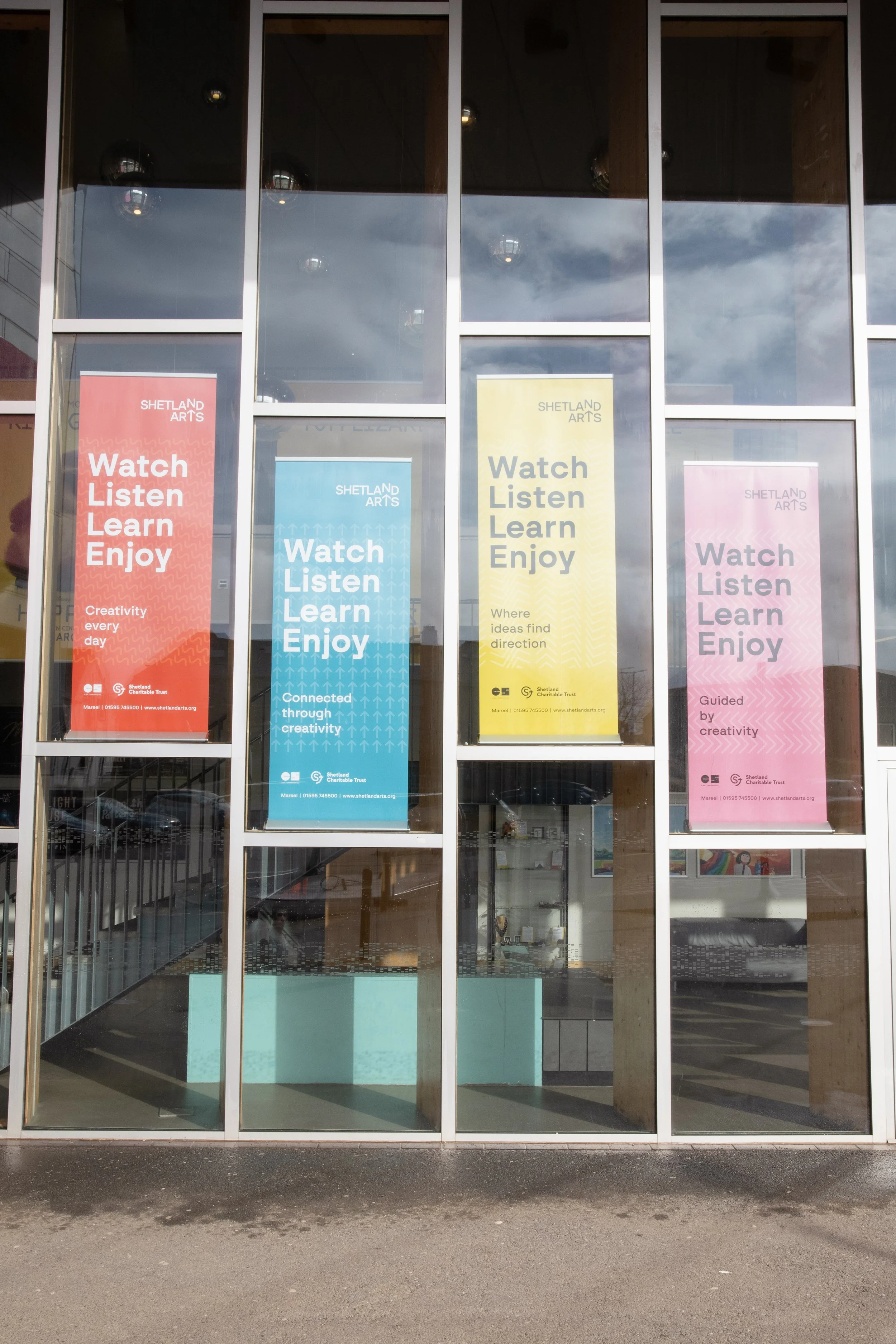
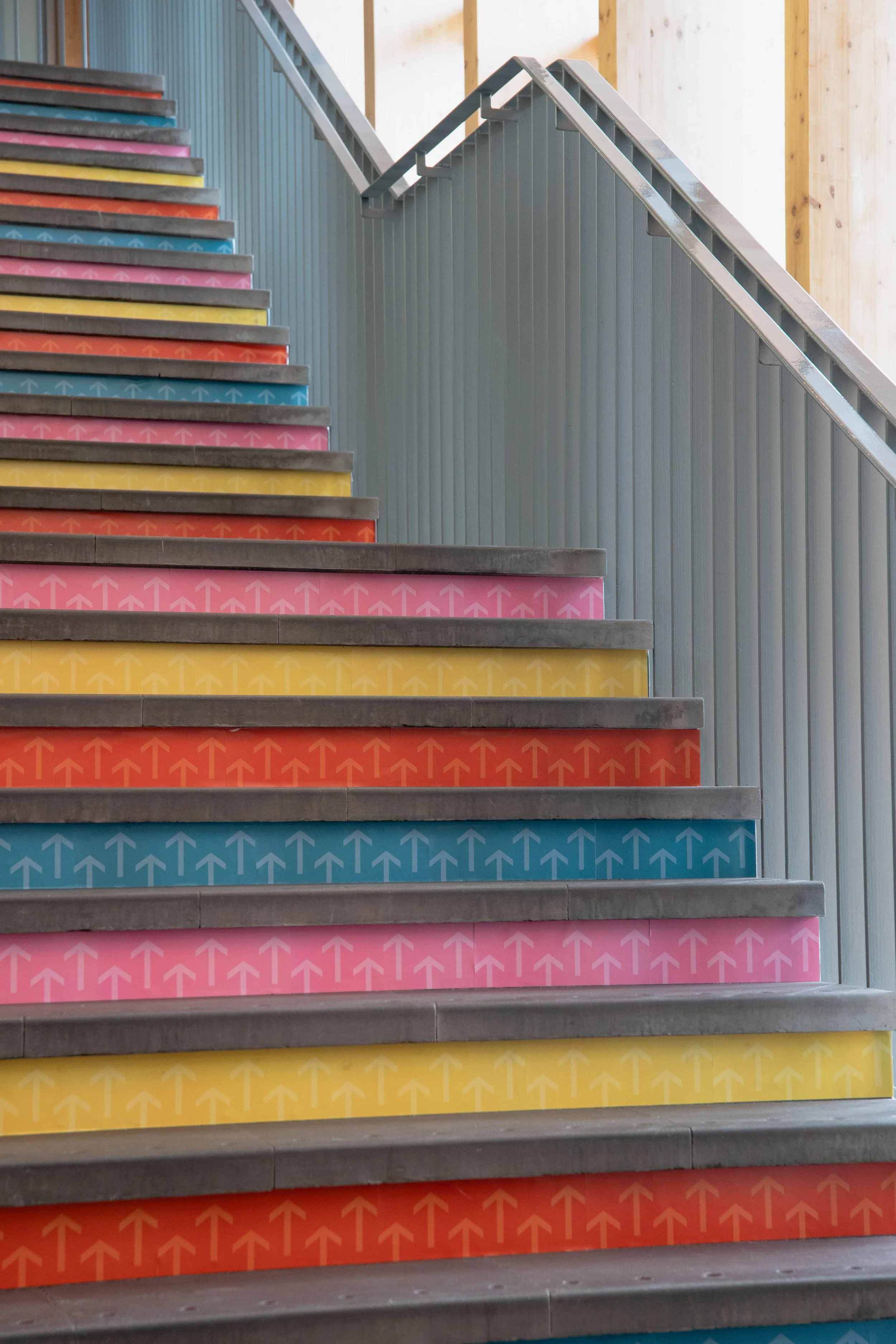
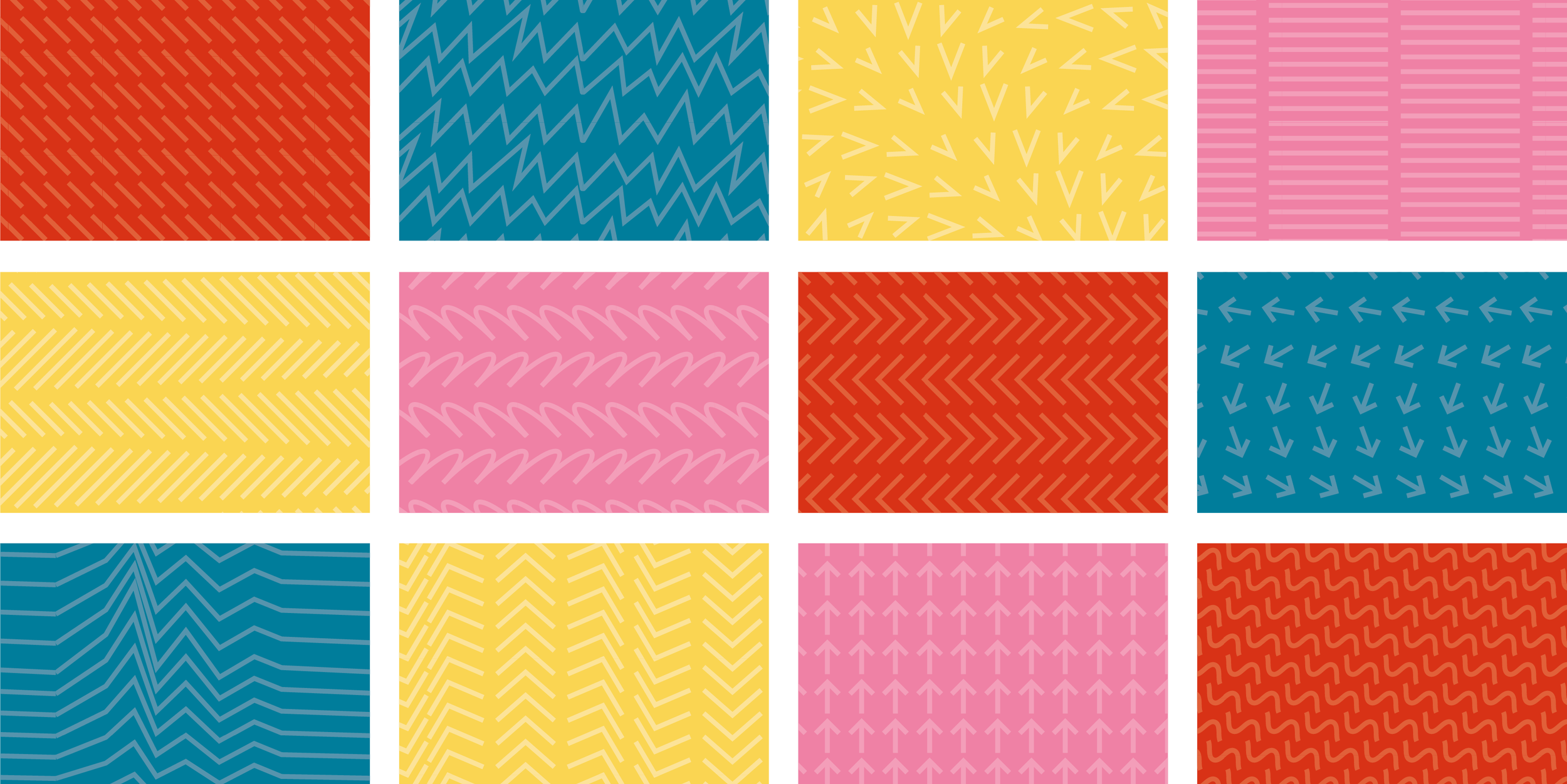
On the visual front, we delivered a new logo, static and motion graphic identity assets, a comprehensive brand strategy, marketing templates, and materials ranging from team t-shirts to lanyards, banners and more. We introduced the distinctive Swiza typeface and led with the colour red. We brought in a range of patterns that speak to the energy and variety within the organisation, using the lead red and the secondary colours of yellow, pink and teal.
On the copy side of things, we created tone of voice guidelines, a bank of key messaging, and we copyedited the content of the organisation’s website, rebuilt by the folks at Maraid.