darts and the point
Branding | Wayfinding | Signage | Print
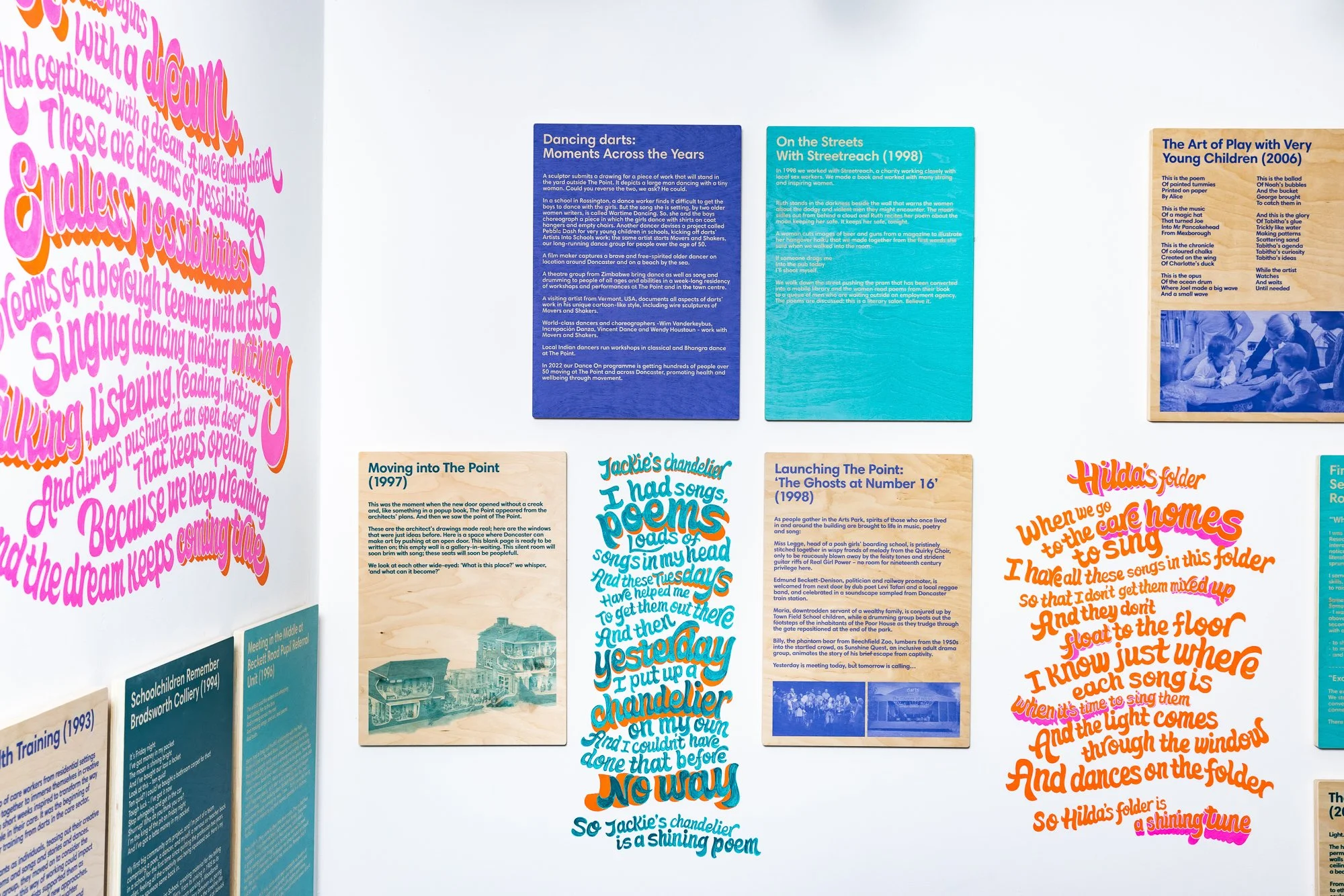
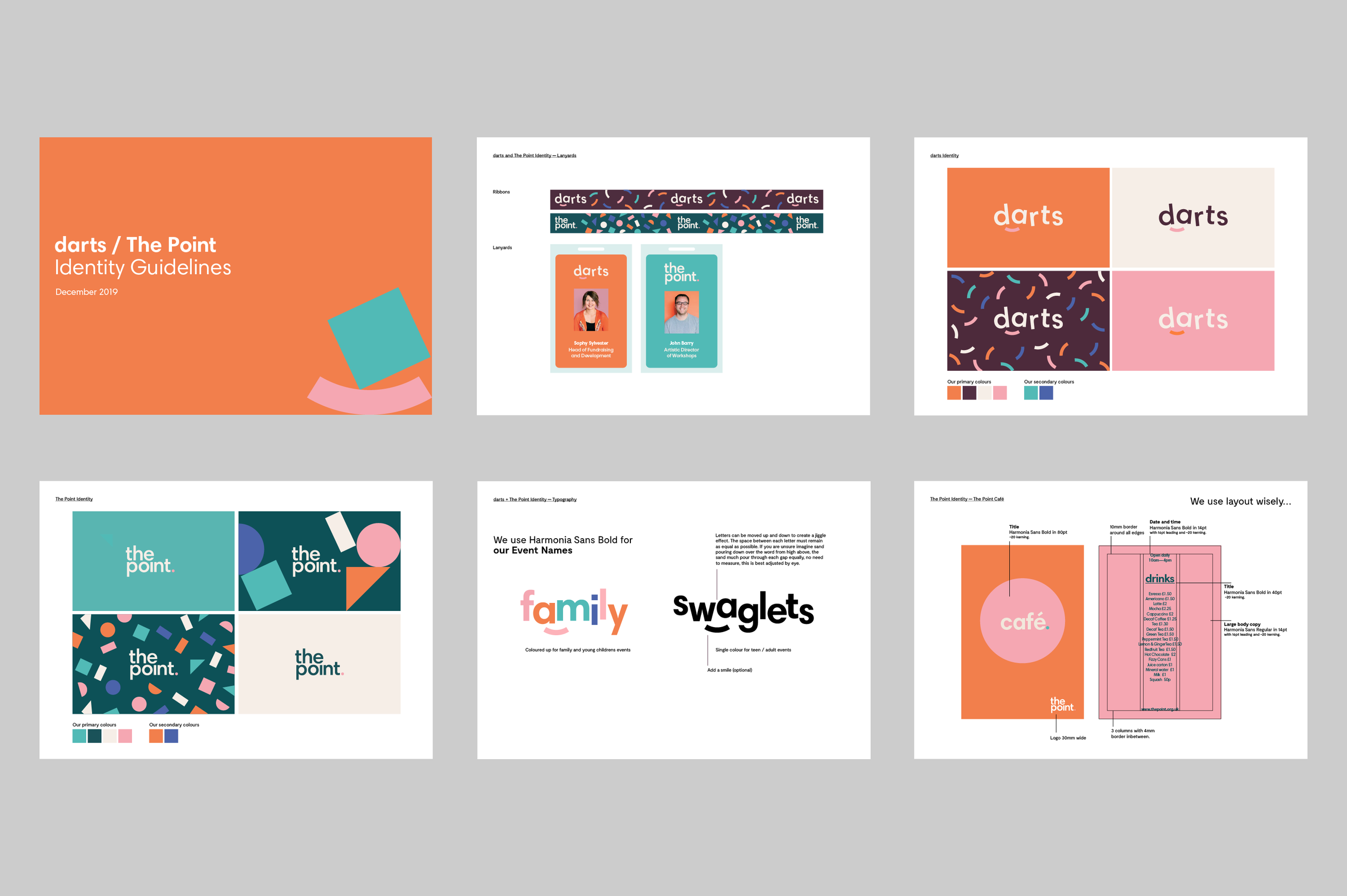
Branding a community arts hub
darts is a participatory arts charity. It offers a safe space to try different, sometimes challenging, and often transformative creative activities.
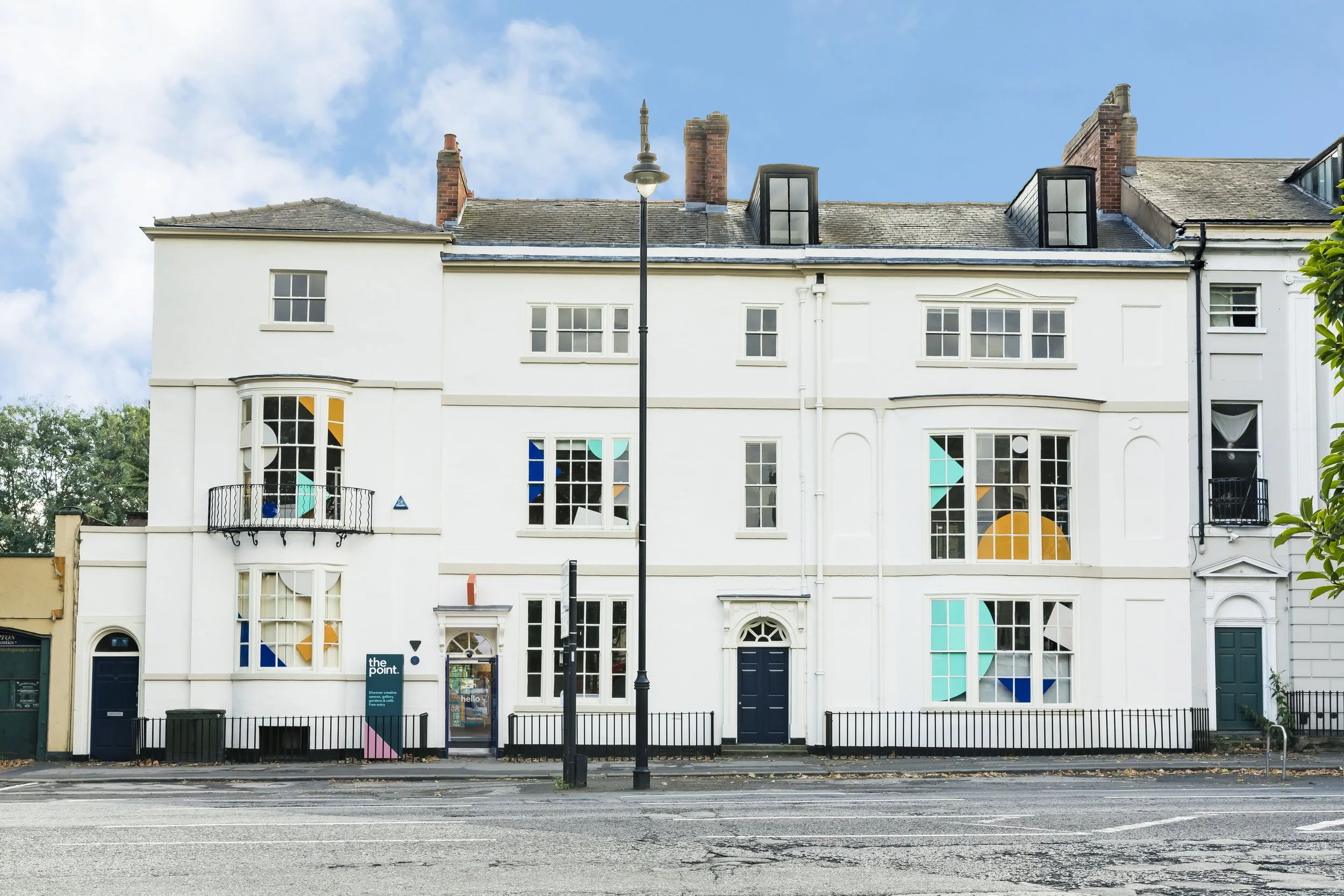
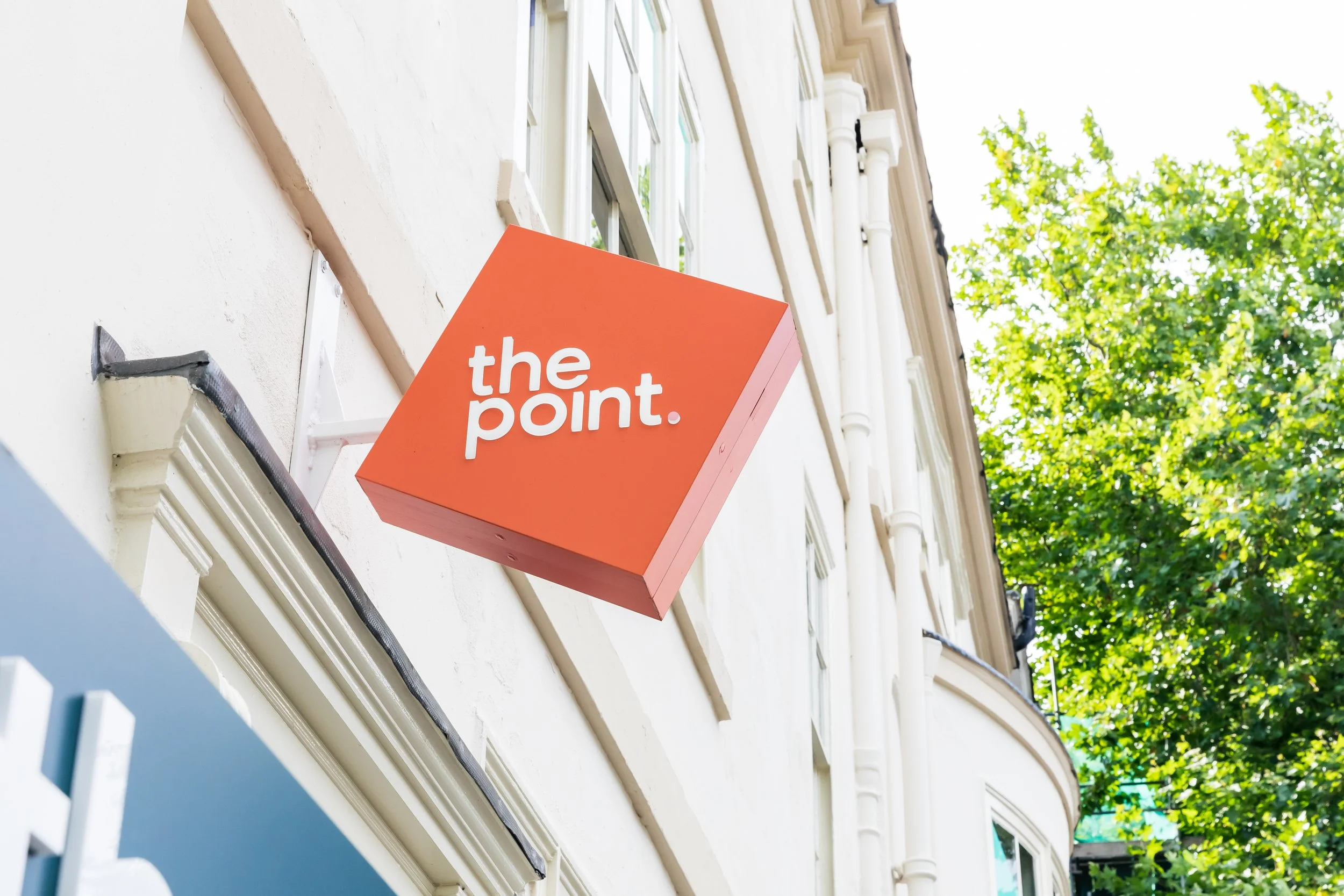
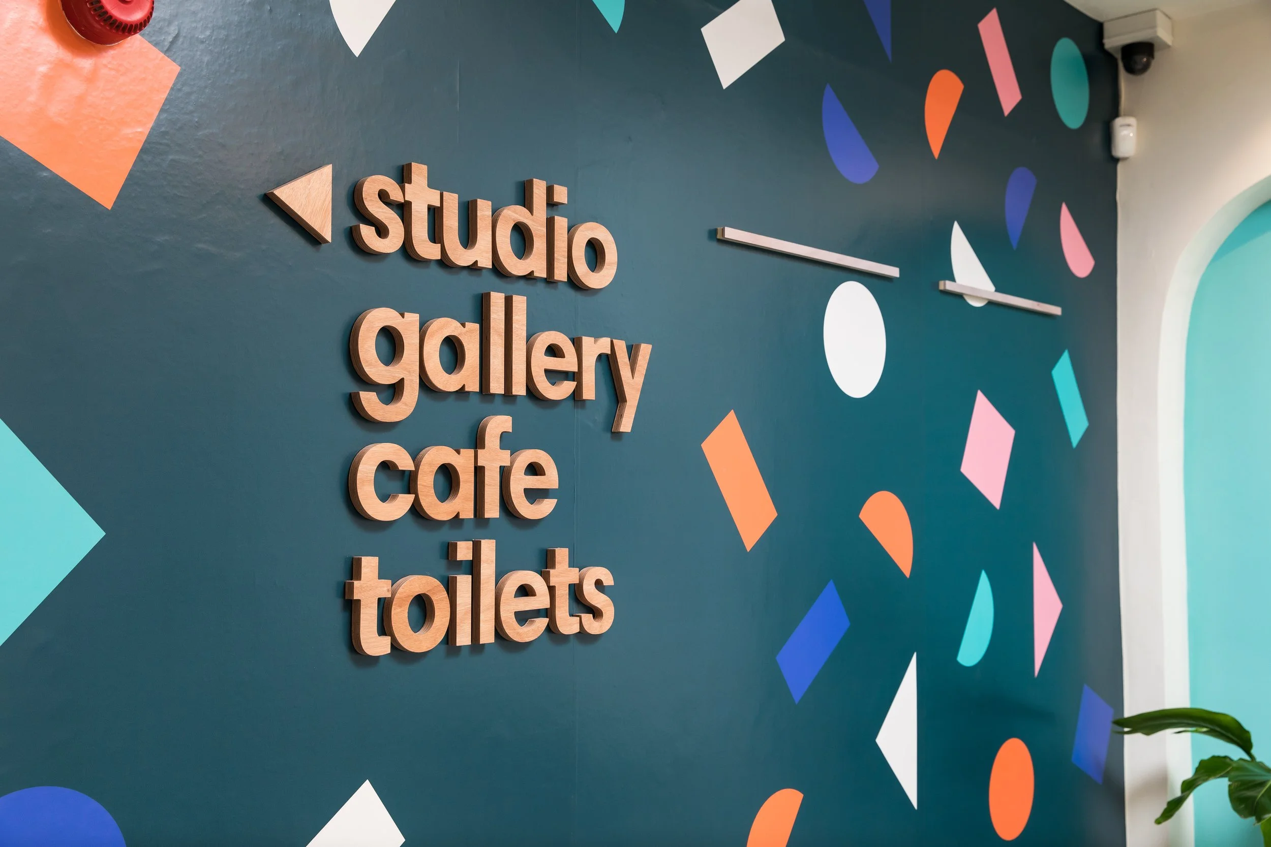
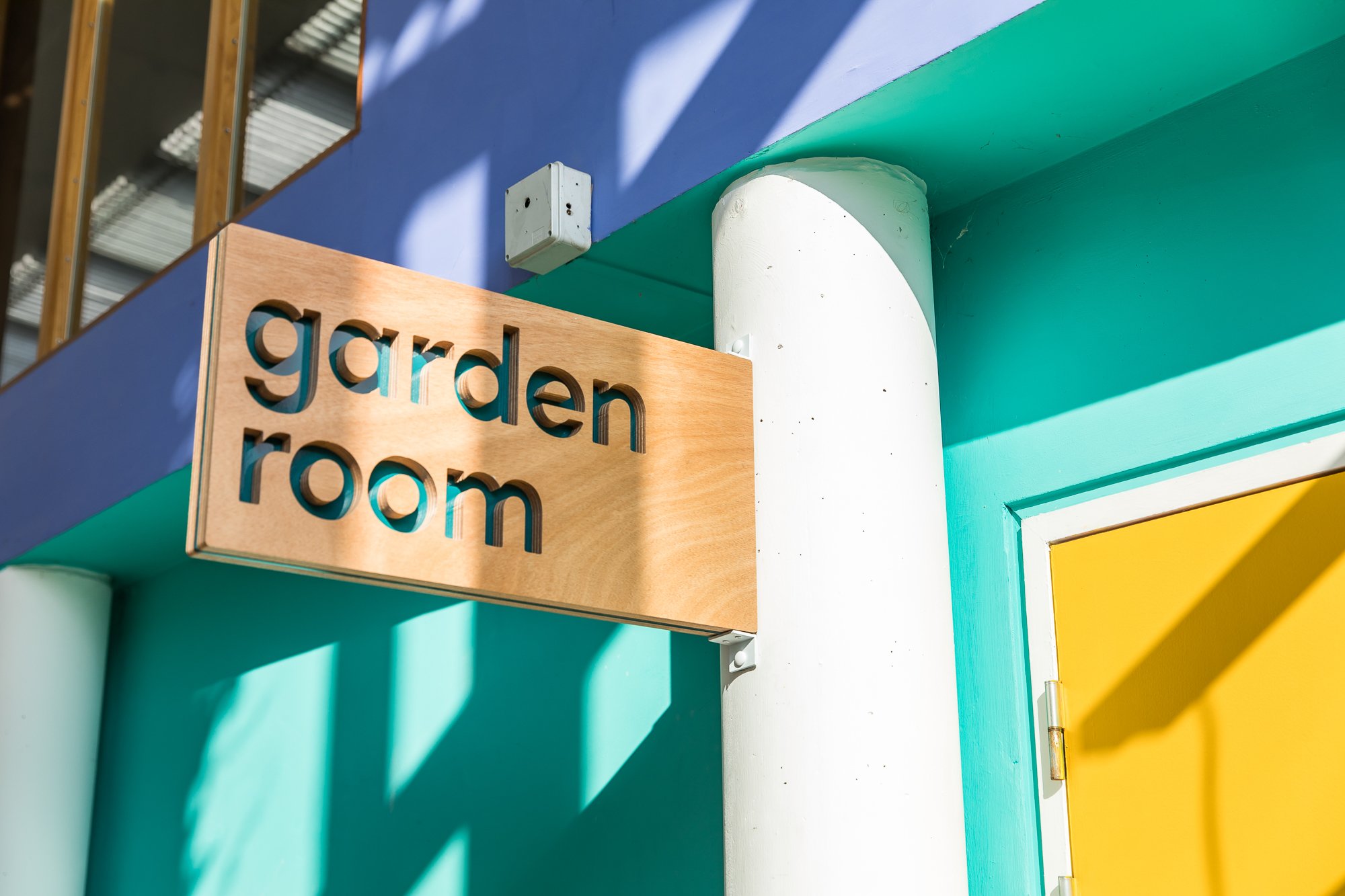
darts is located within the point, a cultural hub in the heart of Doncaster. We undertook a full rebrand of both organisations to give each their own look and feel, while retaining a familiarity between the two.
The brands share a colour palette, with each having its own lead colour. They also each have a brand pattern. Shared elements are purposeful to ensure cohesion between the brands and their touchpoints.
We applied the new brand across the point building through interior and exterior design, signage and wayfinding. We used consistent colours, shapes and materials to create a sense of warmth and playfulness.
“We have been consistently impressed by Eleven’s professionalism, creativity and high quality workmanship. Whether small jobs or larger, more complex projects, the same level of care and thought is provided to produce an excellent outcome.”
Sophy Sylvester, Director, darts